Why does a video about a satin finish lipstick send your shopper to a homepage promoting skincare? The lipstick is available, but you've made them recover the product and the route from memory before they can consider buying it.
Using the same popular page for every campaign can simplify account administration. It can also make the customer's task unnecessarily difficult. Start destination planning with what the advert has already established, then choose the page that preserves that product and answers the next relevant question.
Write down what the advert has settled
Identify the product, shade, format and main argument shown. If the creative narrows the choice to one item, the destination should acknowledge it. A visitor shouldn't need to search the whole range just to reconnect with the offer that brought them there.
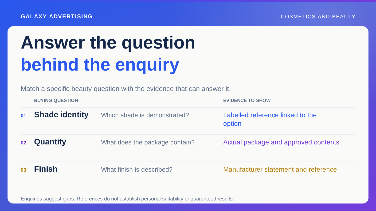
Next, identify what remains unresolved. They might need to compare finishes, check current availability or understand the package. That question helps you decide what role the page needs to play, rather than choosing it because the link is familiar.
Don't assume the final video frame stays in someone's memory. Labels, images and page headings should make sense independently. The connection works better when a person can recognise the subject without having studied the production brief. Familiarity inside the team can hide how much work a new visitor faces.
Keep the exact variant when it matters
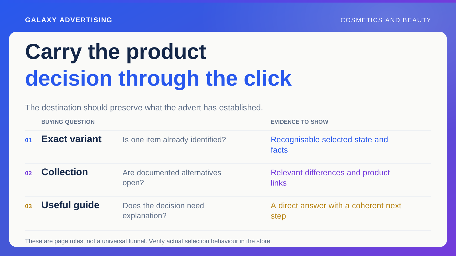
If a particular shade or configuration is central, check whether your actual store setup can retain that selected state clearly. A variant is the selected shade, size or configuration. Follow the campaign link and verify the label, image and price you actually reach.
If the system can't reliably retain that state, make the intended item easy to recognise on the page itself. Don't promise technical behaviour nobody has tested. The plan needs to reflect what your store does, rather than what everyone assumes it ought to do.
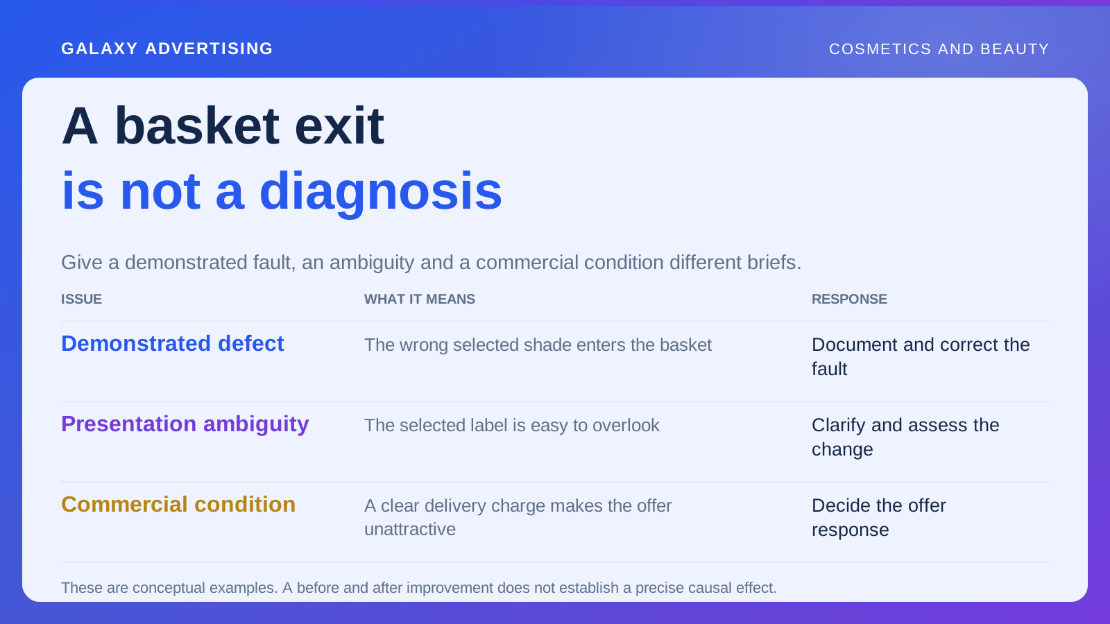
Check what happens when that variant becomes unavailable. A silent switch to another default can change the offer. Name an owner who can decide whether to change promotion, explain an alternative or pause the route until the original offer returns. That decision shouldn't be made accidentally by a default setting.
Choose a collection when there's still a choice to make
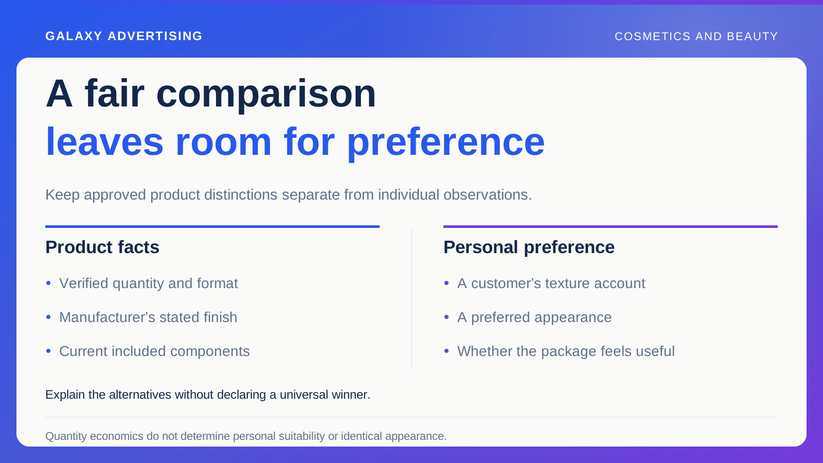
A focused collection can help when the advert introduces several documented alternatives. Arrange those products around differences relevant to the decision, rather than listing them in an arbitrary order. The collection needs to support a real selection task.
Keep it narrow enough to help. Creative about lip finishes doesn't necessarily justify a page containing every cosmetic category. The broader the destination, the more work the shopper must do to recover the original question. More choice on a page isn't automatically more useful choice.
Retain clear links to individual products and their verified facts. The collection helps someone select; it doesn't replace the information needed to assess the chosen item. Its commercial job is to make the next comparison easier, with a clear route into the product when the visitor is ready.
Give a guide a question worth answering
Use a guide when a decision genuinely needs explanation. Understanding the retailer's available formats or reading quantity information could warrant it. Answer that question directly before introducing another sales argument. Otherwise, the promised help gets lost in another pitch.
Don't insert a general article between someone and a product they already recognise. Extra reading isn't automatically a more sophisticated journey. If checking the product is the next useful action, the guide can become an unnecessary obstacle rather than helpful support.
Connect the explanation to relevant offers and describe differences honestly. Without a coherent next step, a guide can educate without helping the intended retail decision. Going the other way, an unsupported personal recommendation can exceed what your reliable information establishes. Keep the route useful within those limits.
Put essential facts beside the choice
Place quantity, variant labels, included components and approved product information where shoppers can find them while assessing the offer. More copy isn't the same as better access to an answer. Think about where the question arises, then check whether the answer is reachable there.
Use clear labels for information that needs expanding. Someone checking the package shouldn't have to guess which decorative section name contains its contents. Inspect this on a phone, where a long page can obscure the connection between a selector and its explanation.
Keep purchase conditions accessible too. Product and transaction decisions are connected. Clear shade presentation can't compensate for a delivery or payment route with important conditions that remain hard to understand. Both parts need to support an intelligible decision.
Read the page as the next part of the advert
Compare the page's opening state with the main impression of the creative. Look for a different package image, an obsolete promotion or a headline making a stronger promise than the approved advert. The destination shouldn't quietly change the argument.
Ask someone unfamiliar with the campaign what they think is being offered and what they'd check next. Their answer can expose ambiguity. It doesn't represent every customer, and you shouldn't treat it as though it does.
Separate verified mismatches from testing ideas. Correct a wrong product image. For a possible improvement to information order, write a hypothesis and identify a suitable observation. That keeps the review from becoming a long, unprioritised collection of preferences.
Keep the link reference in the production record as well as the account plan. A creator can describe one format while an account manager later replaces the destination, breaking the relationship without either noticing. A shared reference makes the change visible and gives reviewers somewhere clear to start checking.
Keep owning the route after launch
Record the creative, destination and intended product state. Assign ownership for changes to stock, packaging, price and promotional conditions. A coherent route can come apart when one element changes independently, even if it worked perfectly at launch.
Read product exploration, enquiries and orders with that route in mind. Repeated questions about which shade appeared in the advert suggest the connection may still need work. If people understand the offer but don't find it commercially attractive, another layout may not resolve that problem.
The shopper has already made progress before clicking. Respect that progress by carrying the product and question forward, with reliable information and a clear next action. The useful page is the one that does that job accurately.