You open your oak dining table collection, an individual table page and a blog article. All three pursue variations of “oak dining table”, and all three have been given more copy. Yet it is still hard to tell which page helps a shopper choose.
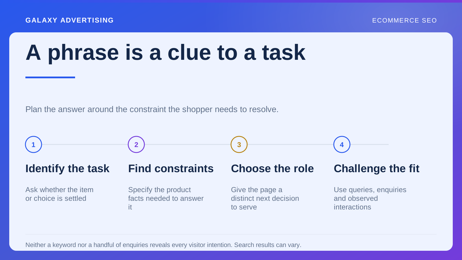
More words cannot settle a question of purpose. First decide whether someone needs to browse alternatives, investigate one item or resolve a question spanning the range. Each task gives a different page a reason to exist.
Choose the page around the shopper’s task
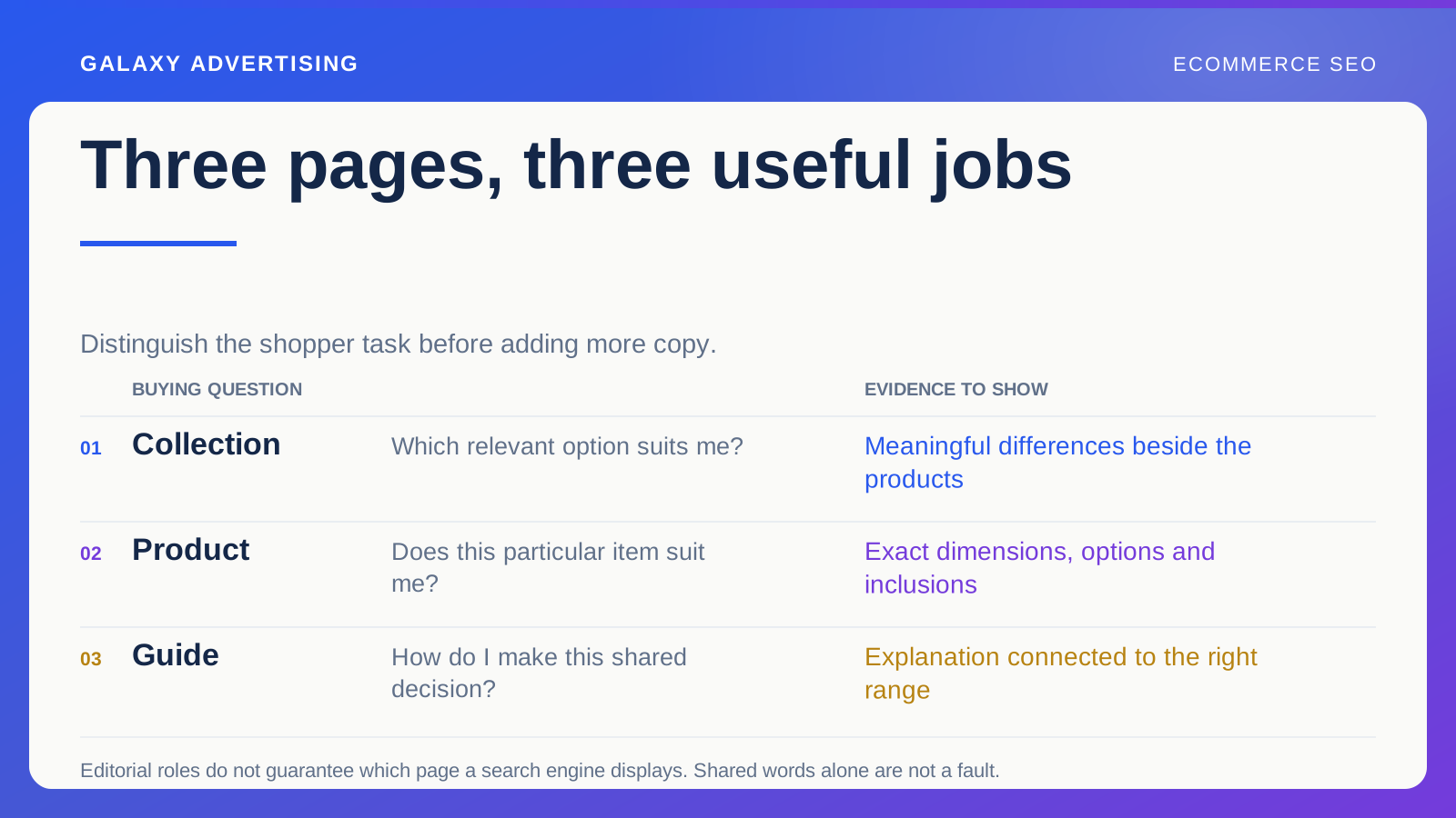
A collection helps someone compare a relevant set of options and narrow their choice. A product page explains one item and its available configurations. A buying guide tackles a decision that may need explanation before someone can choose a collection or product.
These are editorial roles, rather than promises about what a search engine will display. Results vary, and several page types can be relevant to a broad query. The role gives you a defensible purpose for each page, even when the search result changes.
Ask what the reader should be able to do afterwards. If every answer is “buy a dining table”, you have not yet made the distinction useful enough to guide the work.
Help them compare without burying the products
For an oak dining table collection, explain differences that affect selection: seating capacity, shape, dimensions, extension options and finishes. Keep the useful comparison near the products, with a straightforward browsing experience.
Do not push the product grid far down the page beneath a long introductory article. Someone comparing tables needs to see the tables. Supporting guidance can be concise, expandable where appropriate or linked where that decision arises.
Read the filter labels as a shopper would. Your merchandising terms may be less useful to someone thinking about a small dining area or occasional guests. The labels should describe choices they can understand, rather than require them to learn your internal language.
Let the product page explain this particular offer
An individual table needs accurate dimensions, material details, finish photographs, available configurations and delivery information. Explain what is included, and which choices affect price or practical suitability. These details help someone investigate the item in front of them.
Repeating the collection introduction does little to distinguish this table from the next. The product description needs to make the individual offer clear. That is how the page earns its place.
Represent the selected configuration accurately where relevant. A picture of the extended table beside the price of the smallest configuration can leave the offer uncertain unless you explain the difference. Search visibility has limited commercial use if the visitor cannot interpret what is being sold.
Give the guide a question the catalogue cannot answer well
“How much space do you need around a dining table?” gives a guide a clear task. It can explain measuring, discuss practical constraints and help readers compare what they find with your product information.
That explanation should do work the collection cannot efficiently do. A lightly rewritten catalogue page is not enough. Use illustrations, a worked example or a measurement checklist where those help someone make the decision.
Keep illustrative layouts in their proper place. Rooms, chairs and household needs differ, so an example is not a universal requirement. Explain how readers can inspect their own circumstances and which product facts they need to check.
Put the link where the question occurs
Link to the measurement guide where someone is likely to wonder about fit. Within the guide, lead to a collection where they can apply the explanation. A product page can link to guidance that resolves a genuine uncertainty, rather than displaying unrelated reading for its own sake.
Make link wording descriptive. “Compare extending oak tables” explains what comes next more clearly than “click here”. Maintain the destinations as collections and products change so a useful label continues to describe a useful route.
A connected content system should help the visitor progress. Circulating someone around a wheel of pages is not a task in its own right. Each link needs a reason grounded in what brought them there.
Give every URL an editorial test
For each address, write the reader’s task, the facts needed and a useful next destination. Your collection might compare available sizes. The product page might establish whether a particular configuration fits. The guide might teach the measuring process.
Those statements expose overlap more usefully than arbitrary keyword quotas. Ask someone unfamiliar with your site structure to follow the routes in both directions. Can they apply the guide to a collection and reach the right product facts? Can they find the guide from a product when the measurement question arises?
Record dead ends and unclear labels. This is a content review as much as a technical linking exercise. The presence of a link does not establish its value; helping the next decision does. Repair the route before commissioning another page that will lead readers into the same confusion.
Look for repeated purposes before publishing again
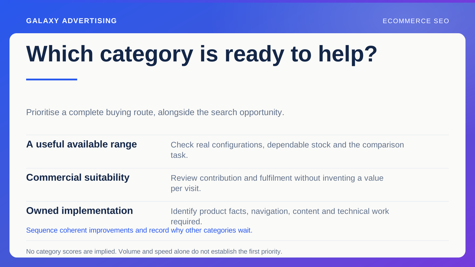
List the existing pages on the subject. Describe each one’s reader and decision in a sentence. If several descriptions amount to the same thing, investigate clearer roles, consolidation or content that is substantially different. Adding more material should follow that judgement.
Shared words alone do not establish a technical problem. Related pages will naturally use similar product language. The concern is redundant purpose: several pages giving substantially the same answer without a useful distinction.
Check that search systems can reach the content too. Helpful information still needs discoverable links and a technically accessible page. Google’s helpful content guidance is a reference for usefulness, rather than a prescription for a magic article length.
Try removing each page in your mind. What useful task becomes harder without the collection, the product page or the guide? A page with a strong purpose gives you a specific answer. If its disappearance changes nothing, another thousand words will leave the underlying duplication waiting for you.