You select the sofa shown in a room photograph, but the option label describes a different arrangement. The fabric name means little to you, and the delivery explanation seems to cover only part of the range. The website looks refined. Specifying what would actually arrive is another matter.
A conversion audit becomes more useful when you try to specify an order as a new customer. Follow the decisions they must make and record missing, contradictory or awkward information. That gives your team a clearer improvement brief than another debate about whether the page feels premium.
Give the review a real buying task
Choose a meaningful configuration and describe the intended purchase. You might compare two sofa arrangements for a room, or identify a dining package in a particular finish. Give the exercise something concrete to establish.
Start with the ordinary route for products you actively promote. An unusual edge case deserves priority if it affects material demand or reveals a serious defect, but it should not displace the normal route without that reason.
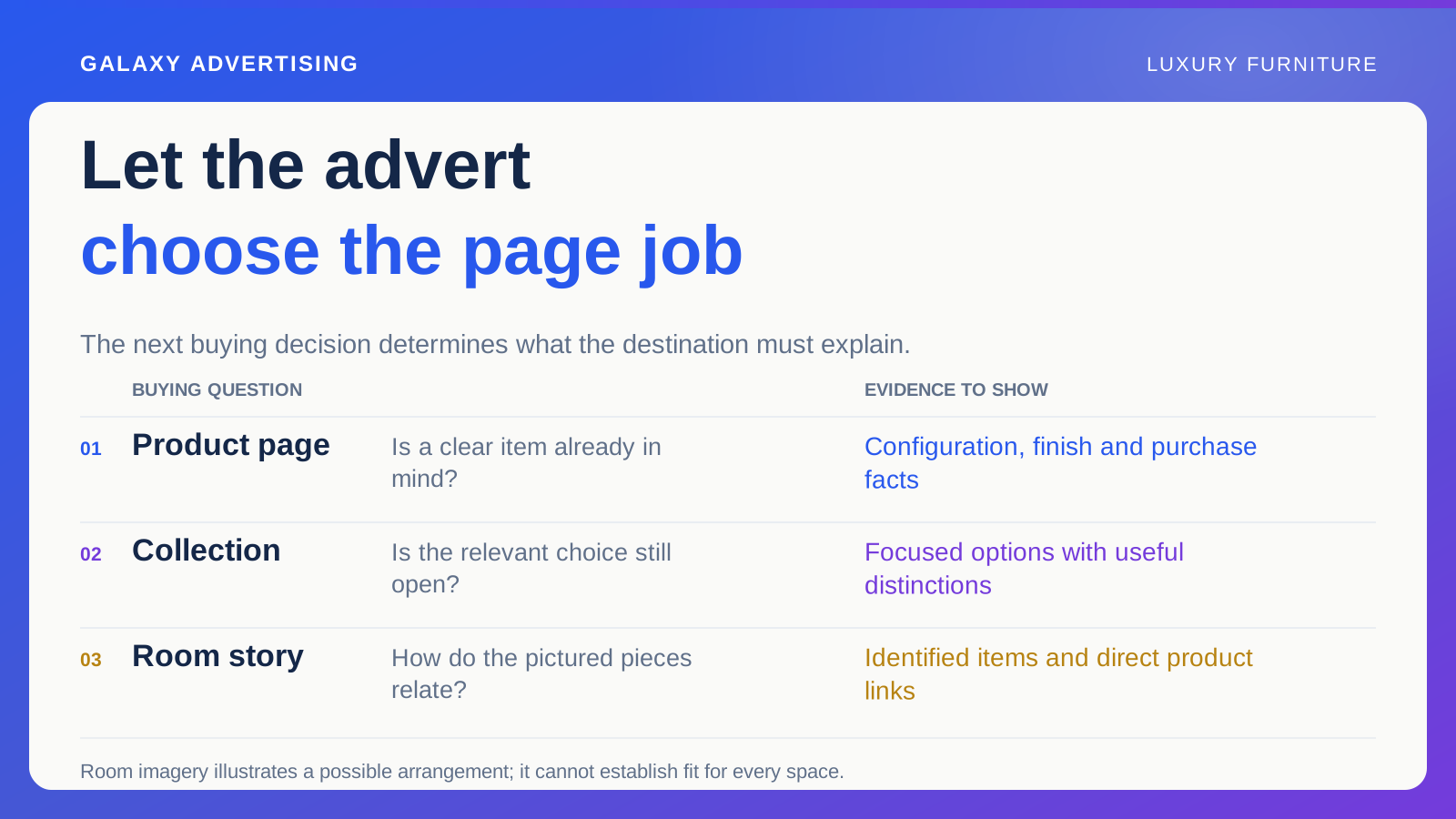
Record where the customer begins, such as an advertised image or collection link. An employee opening a familiar product page has knowledge a new visitor does not. If the starting image implies a different package, you need to see the page through that context, not judge it by its address alone.
Say exactly what is included
Using only the information in the route, try to state the arrangement. Do the image, option label, dimensions and price all identify the same offer? Do not let your familiarity fill the gaps.
List components that somebody could reasonably mistake for included items. Extra modules, stools and styling objects can make a photograph appear more complete than the selected package. What matters is what a new visitor can establish, rather than what merchandising intended the scene to communicate.
Keep evidence of anything unclear: a screenshot, the selected option and the item reference. That lets somebody reproduce the problem. A note saying the page needs more clarity simply hands the diagnosis to the next person.
Follow the finish all the way through
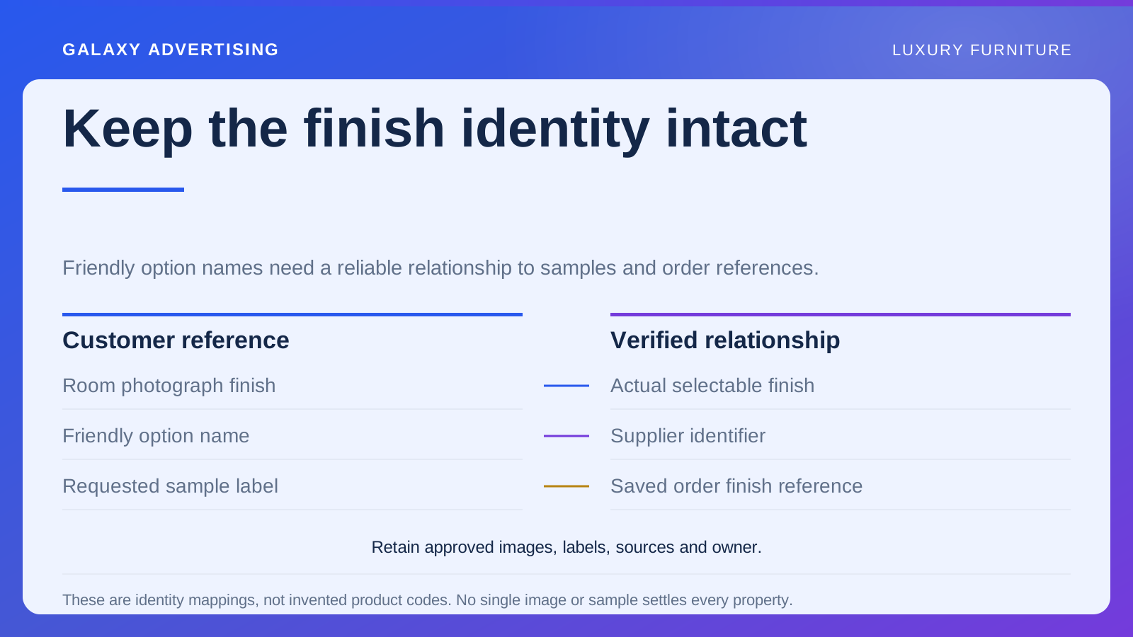
Move from the room image to the material or colour choices. Is the pictured finish identified? When you change an option, does the relevant information update coherently?
A screen cannot reproduce a physical material perfectly, and your audit should not demand that it does. Ask instead whether the page explains its references, their limits and any sample route you actually provide.
Watch for information disappearing during selection. Changing colour should not disconnect a useful specification from the selected variant, meaning the chosen size, colour or configuration. Establish which facts are shared and which belong to the particular option. Both need to remain understandable.
Find the delivery answer before committing
Locate the service information for the intended order. Can the customer understand the relevant charges, availability and service contents before making a commitment? A general statement elsewhere on the site may not settle the specifics.
Distinguish a missing fact from a question that reasonably needs individual confirmation. A property specific delivery enquiry may need staff input. The route should explain how to get that answer and what information your team requires.
Verify documented conditions with the responsible owner. An auditor should not invent a more attractive delivery promise to simplify the page. You are making the real offer clearer, rather than substituting the service you wish it included.
Try the meaningful steps on a phone
Repeat the selection on a narrow display. Check option controls, image changes, access to measurements and the connection between the chosen package and the price shown.
Record actual difficulties. A blanket rule that every important fact belongs on the first screen is not much help for products needing substantial detail. Can customers find and understand the information when it becomes relevant? That is the useful question.
When a control fails, reproduce the failure under the conditions you observed and assign it as a defect. Keep it separate from a preference about button styling or page composition. Demonstrated consequences give the business a better basis for prioritising the work.
Give different findings different jobs
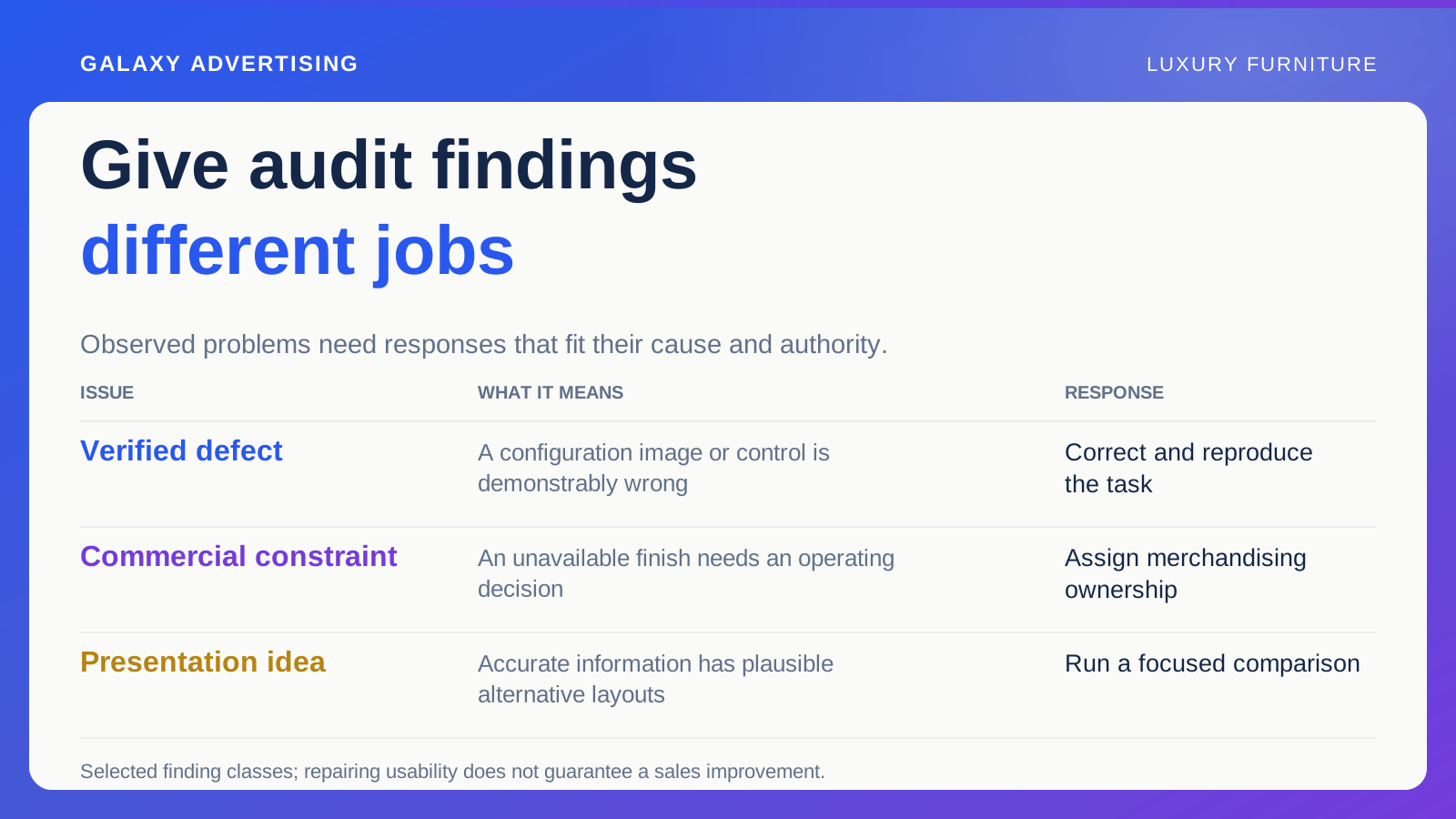
Group findings into verified defects, information gaps, commercial constraints and presentation ideas worth testing. They need different responses and different owners. Calling everything a conversion recommendation makes the brief less useful.
An incorrect configuration image needs correction. An unavailable finish may need a merchandising decision. Two plausible ways to present an accurate measurement could justify a focused test. Those distinctions matter when somebody has to implement the recommendations.
For every material finding, name the customer task, the observed obstacle and the correction's acceptance condition. A finished design task is not necessarily a resolved buying problem. Somebody needs to check the route again.
Include enquiries in the task. Submit or review a representative request with its product reference and inspect what the receiving team can understand. The selected configuration can disappear in the handover even when the page is useful. Record whether staff must ask customers to repeat information already supplied, and identify who can correct the lost context.
Check that the repaired route describes an order
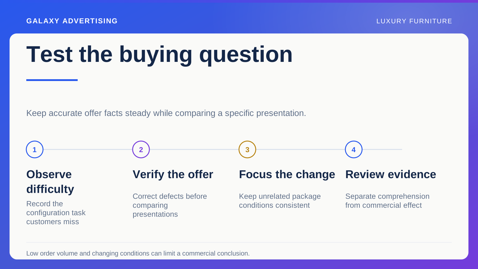
Repeat the original task after the changes. Can you now describe the configuration, finish, price and service consistently? Ask somebody unfamiliar with the range to explain the resulting offer in their own words.
That confirms a specific information or usability problem has been addressed. It does not guarantee a sales improvement. Commercial results need their own review, with relevant stock and campaign changes kept in context.
A strong audit leaves fewer unresolved buying decisions and a record of why each correction matters. The purchase should be accurately understood and usable by suitable customers. That is a more useful destination than a long report where every observation becomes another untested design opinion.