What if someone follows an AI answer to your storage bed guide and lands beside a brand introduction, while the package distinction they need is buried below? You've got the information, yet the customer still has to hunt for it and work out whether it applies to their purchase.
They haven't necessarily shared the journey your introduction assumes. Your job is to give the answer enough context to stand up where they find it, then make the next step useful. That's sound information design however somebody discovers you. You don't need to know their entire earlier conversation to do it well.
What fact have they come to check?
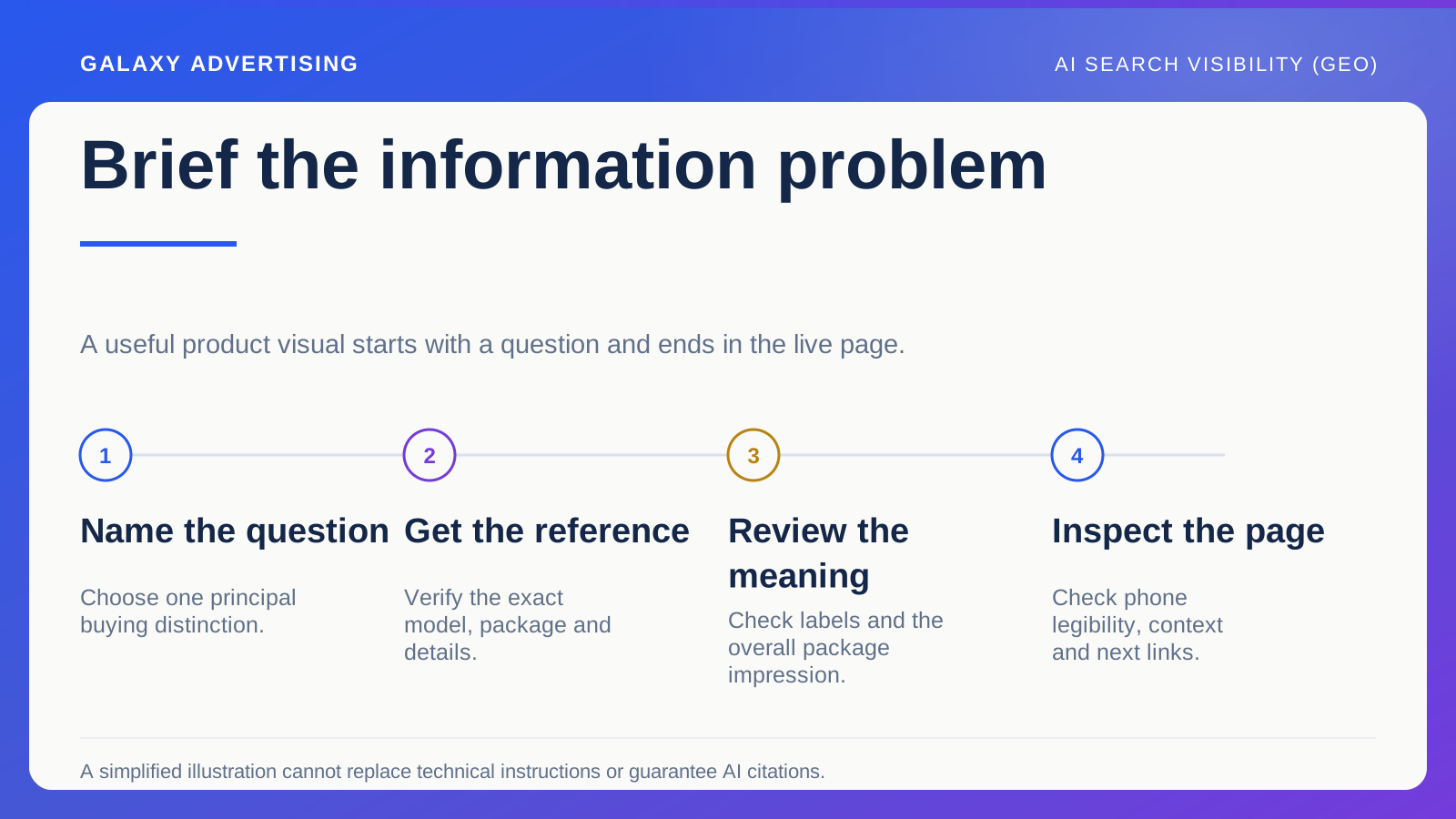
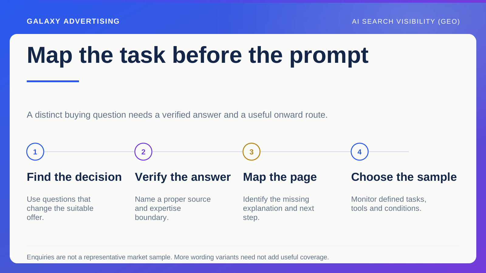
Start with the page's main buying questions and any source links you've actually observed. Which section supports the statement the visitor could be investigating? Find that before changing the introduction or adding another promotional panel.
You cannot assume your business has access to their complete earlier discussion. Clear headings and accurate subject labels need to do the orientating. Private context you don't possess cannot carry the explanation for you.
In a hypothetical storage bed guide, the answer might distinguish two package arrangements. Say which configuration, meaning the selected arrangement, you're describing and where its full details can be inspected. A sweeping promise about stylish bedroom solutions doesn't help someone establish which package you mean.
Let each section make sense where it sits
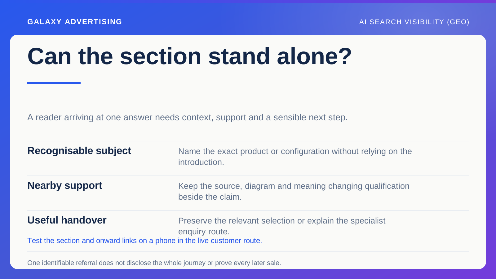
Read an important section as though the introduction weren't there. Does it identify the product or configuration clearly? Sometimes replacing an ambiguous pronoun with the proper reference is all the extra context a reader needs.
That doesn't mean repeating your opening before every answer. More words can make the page longer without making it clearer. Give each section its own job and include the context needed to understand that particular statement.
Treat headings as signposts. A practical label tells someone where a package distinction belongs; “discover more” asks them to guess. They shouldn't have to read through several promotional paragraphs to discover whether they've found the right place.
Put the support beside the statement
Keep the relevant source, diagram or verified detail close to the explanation it supports. Make it clear why it's there and precisely which part of your statement it establishes. Evidence is most useful when its relationship to the claim is visible.
A general reference list cannot do that job for every claim. A manufacturer might verify a dimension without verifying your delivery promise. Those are different assertions, even when they sit in the same paragraph.
Keep any qualification that changes the meaning inside the section too. Removing a condition might produce a neat, quotable answer. It can also leave the customer understanding an offer you don't actually make. Accurate understanding matters more than making every sentence sound absolute.
What should they do once they understand?
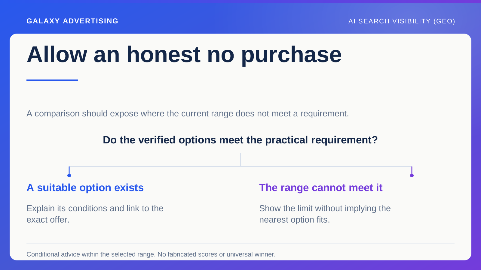
A configuration explanation should lead towards the relevant product or focused range. If the question needs specialist assessment, explain the appropriate enquiry route and what information your business needs to respond properly.
Sending everyone to the same general contact form misses that distinction. Some readers can carry on independently once the facts are clear. Others need a specific answer, and a vague form label doesn't help them ask for it.
Watch the product handover as well. Don't explain one arrangement carefully, then drop the visitor into an unfiltered catalogue of unrelated alternatives. Where your site's functionality allows it, preserve the meaningful selection so the next page continues the decision you've just helped them make.
Look at the answer on a phone
Inspect the heading, relevant image and surrounding explanation at a narrow screen size. Large promotional elements can push the useful answer a long way from where the reader expects it. The page may contain everything while making the important bit surprisingly difficult to reach.
Test the links and option selections. Your explanation might be right, but the next page could open on a different variant, meaning the selected size, colour or configuration, or make the advertised package hard to identify.
A desktop screenshot won't settle this. A diagram that's readable at full size can be useless on a phone. Simplify the visual where needed and retain the essential explanation in accessible page text. Tiny labels shouldn't be carrying the whole answer.
Measure the job this page actually does
For visitors you can identify, review relevant onward product exploration, enquiries and orders using consistent business definitions. A guide can help someone make a considered decision even when their first visit doesn't end in a purchase.
Keep supporting interactions separate from the main commercial outcome. Someone opening a specification and then ordering may have taken two steps in one journey. You haven't necessarily acquired two customers.
Nor should every later purchase be assigned to the source link without a defensible attribution basis, meaning a sound way of connecting the route to the outcome. Establish whether the destination is useful and what activity you can observe. One identifiable referral doesn't supply a complete customer history.
Give the next correction a specific purpose
Use customer questions and what you've observed along the route to choose the next change. Perhaps a section needs a clearer label. Perhaps the package diagram is out of date, or the product range handover is too broad. Correct the problem you've found.
Then check the live route. Rewriting a source paragraph doesn't prove that the intended explanation now appears correctly on the published page. Follow the path the visitor will actually use.
Ask someone unfamiliar with the guide to start at the relevant section rather than at the top. Can they identify the product, understand the qualification and find a sensible next action? That checks whether the section stands on its own without claiming to recreate every possible arrival.
If they need the whole introduction to understand one factual paragraph, add the particular context that's missing. Copying the entire opening into the section can leave the ambiguous reference unresolved and make everything more repetitive.
A reader arriving from an answer needs somewhere dependable to check it. Clear context, supportable information and a natural next step give them that, without requiring you to know their private conversation or promise how your page will be cited.