 ChatGPT Ads
An advert can identify a compact dining table for a particular space, then send the customer to an entire furniture catalogue. The table is there somewhere. So is all the selection work the advert seemed to have done for them.
That is an awkward handoff, especially when the visitor expected to assess a specific offer. Giving them more products doesn't necessarily give them a better next step.
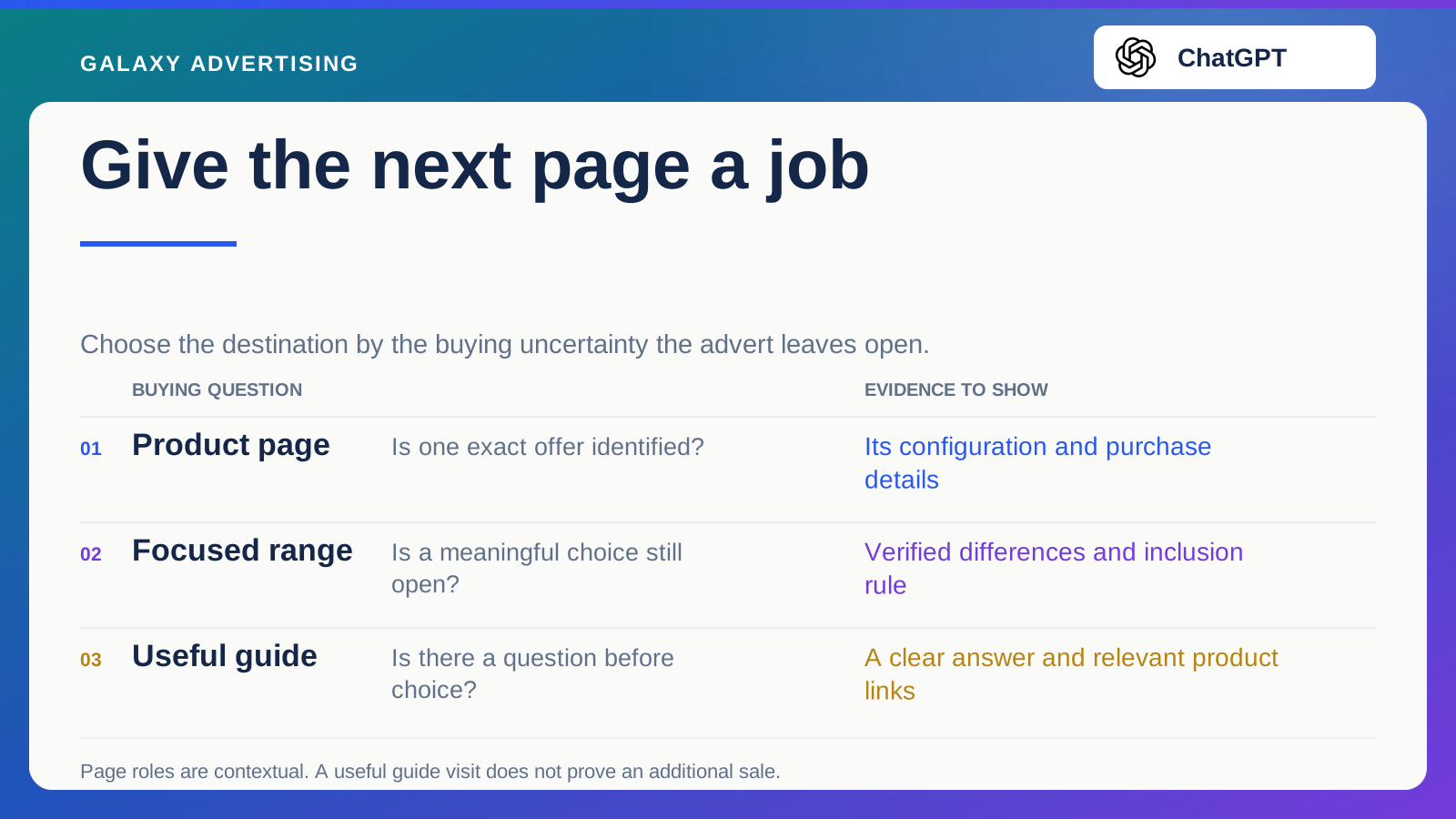
Choose the destination by the uncertainty left after the message. They may need one exact product, a manageable comparison or an answer to a practical question before choosing. Let the page do that job.
What has the advert already made clear?
List the product, configuration, benefit and condition identified in the message. When the image and copy clearly concern one table, make that table easy to recognise on the next page. The customer shouldn't have to interpret a campaign structure to find it.
A broader requirement leaves a different task. If the message concerns choosing a table for a restricted room, people may still need to compare suitable shapes or sizes. A focused selection can be appropriate there.
Look at the actual message rather than deciding from the campaign name. A range campaign can include an asset creating a very specific product expectation. Its specificity determines what a coherent destination needs to do. The organisational label inside the account isn't the experience the customer encounters.
Use a product page for a defined offer
A product page suits an advert that names or demonstrates a particular item. The customer now needs its complete purchase information. Preserve the selected configuration where your site supports that route, so the options remain connected to what they saw.
Keep essential facts close to selection. For the hypothetical compact table, that might mean verified dimensions, seating arrangement, finish options, package contents and delivery service. Don't make visitors reconstruct the offer from several unrelated sections.
Give them ways to compare without hiding the original item. Someone may realise this model is unsuitable and need another size. A relevant alternative link helps them continue. Replacing a clear product proposition with an overwhelming catalogue simply gives them the earlier selection task again. Keep the starting promise visible while allowing an informed change of direction.
Use a focused range when the choice is still open
A collection helps when the inclusion rule reflects the customer's task. Tables suitable for a defined range of spaces is a clearer proposition than a collection described only as your favourites. Explain why these products belong together.
Show the differences that affect choice using verified information. Dimensions, configurations and package conditions can matter. Filters should help people narrow meaningful differences, rather than merely display how many attributes the catalogue contains.
Keep the selection maintainable. When products change, check whether the introductory guidance still describes what's available. A heading can promise a particular solution after remaining stock no longer supports it. That's a mismatch in the offer, even if every individual item has an accurate product page.
Use a guide when a question comes first
Sometimes people need to understand a task before they can choose. Measuring the intended space or distinguishing table configurations can be a legitimate part of the buying route. A useful guide can meet that need.
Answer the question well enough for the guide to be useful on its own. Don't stretch a simple explanation into a long promotional page whose only meaningful action is a sales form. Link to relevant products where the explanation naturally helps selection.
Keep specialist claims within verified expertise. A room layout guide shouldn't improvise structural or safety advice. Where manufacturer instructions or professional assessment are needed, identify the proper source. Reassuring marketing language cannot replace it. The guide earns its place by helping somebody make a sound next choice, within what your business can responsibly explain.
Follow the handoff on a phone
Review the destination at the size and in the context where a customer is likely to use it. Does the opening identify the promised task? Are essential images and labels understandable? The answer needs to survive the actual viewing experience.
Don't hide the main information below a large promotional introduction. Someone arriving for dimensions shouldn't have to scroll through the company story first. Put information in the order the reason for the visit requires.
Test option selection and onward links as well. A clear opening can lead to an unclear variant, the selected size, colour or configuration, or an unrelated product family. You're reviewing a route, rather than approving a screenshot in isolation. Follow its next sensible action.
Give the page a job you can judge
Define what useful progress looks like for the page's role. Completed orders may be part of assessing a product page. A measuring guide may also need evidence of relevant onward product exploration.
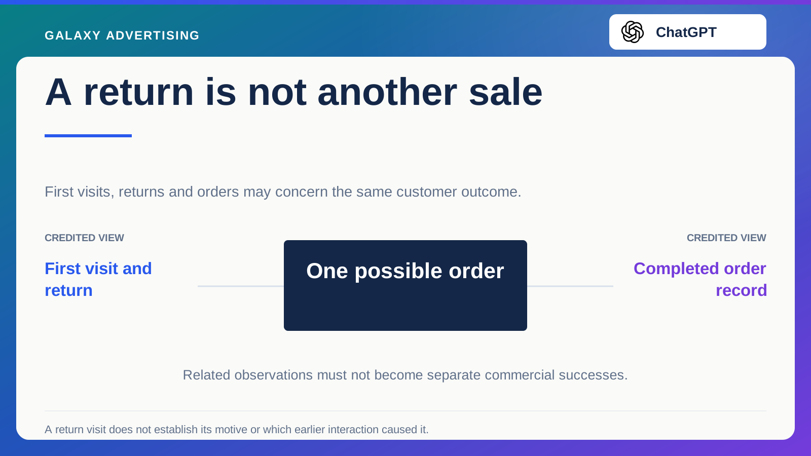
Don't count every interaction as a separate success without considering its connection to the same customer and eventual order. Keep supporting observations distinct from the main commercial outcome.
Explain limits before launch. A useful guide visit doesn't prove an additional future sale. An immediate purchase measure can also miss part of a considered journey. Avoid selecting whichever metric flatters the destination.
Check whether the next link preserves the selection you've helped somebody make. A guide can explain a configuration carefully, then undo that work by sending everyone to an unfiltered catalogue. Retain the meaningful distinction where the site supports it, while letting customers inspect alternatives when their needs change. That handoff belongs in the page's job too.
Change the route for a reason
When results disappoint, inspect the match between page and message and check offer accuracy first. A poorly chosen product page and an unfocused collection aren't a clean comparison proving one page type inherently better.
If a test is justified, record the hypothesis and material differences. Changing package, price and message alongside the destination compares a different offer. It cannot isolate layout alone.
The right amount of choice depends on the decision still left to make. Your best destination advances that buying task clearly, whether or not it has the most products or the shortest route to checkout.