A loafer can be available while its advert makes finding it unnecessarily difficult. The video identifies a particular model and finish, but the link opens dozens of shoes with similar photographs. The customer has to repeat the identification task you appeared to have completed already.
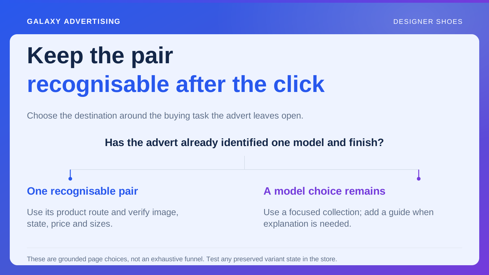
Respect that progress when choosing the destination. Carry the model forward, then provide the information for the next decision. A familiar homepage or popular collection isn't automatically the right page for every proposition. The useful destination depends on what this advert has settled and what the shopper still needs to know.
Record what the advert has made specific
Identify model, finish, price and main argument. When the asset introduces one pair, the next page should acknowledge it. Someone shouldn't need your team's product knowledge to connect the campaign image with the offer. Make that connection intelligible to a new visitor.
Then name the unresolved question. It could concern shape, reliable model sizing information or current purchase conditions. Those questions determine what the destination should do, rather than let the choice default to a page everyone in the account already uses.
Keep asset and link references together. A later destination change can break their relationship while each element still looks reasonable independently. Inspect the complete route in review. An accurate advert beside a plausible page doesn't guarantee a coherent journey between them.
Use a product page when the model is identifiable
For creative about one model and finish, verify the relevant product destination. Follow the actual link and check opening image, selected state, price and available sizes. The page needs to preserve what the visitor recognises from the asset, not merely include the product somewhere.
Where links can retain a finish or variant, meaning the selected size, colour or configuration, test that behaviour. Don't assume it. If the store can't preserve the state, use clear page labelling so the intended item stays identifiable. Technical convenience shouldn't create an unexplained customer puzzle.
Inspect what happens when the demonstrated option becomes unavailable. Silent substitution changes the practical offer. Name an owner who can revise promotion, explain an alternative or take another suitable action through the actual setup. The unavailable state needs a deliberate response, rather than an accidental new proposition.
Use a focused collection for a real model choice
A collection can help when the advert deliberately introduces alternatives and the shopper still needs to choose. Organise around distinctions relevant to that task, such as documented model differences or available finishes. Give the range a decision structure, rather than merely gather products in a category.
Avoid sending a specific styling argument into an unrelated full catalogue. Additional choice isn't automatically helpful when it removes the context that made the pair relevant. The visitor should be able to carry the original question into the next comparison without rebuilding it from scratch.
Keep individual destinations clear, including each model's product facts and own sizing guidance. Sharing a visual category doesn't make a generic fit statement apply to every pair. A collection supports selection while leaving the shopper able to investigate the particular item they choose.
Use a guide when explanation is genuinely next
A comparison or guide can help with a real distinction that needs understanding before selection. Answer that question directly, then lead to the relevant models without forcing another general search. The explanation should advance the decision rather than become a detour in front of it.
Don't insert an article just to make the route feel sophisticated. Someone who recognises the pair may need its availability and model information more than another introduction to brand philosophy. Give them the step their current task needs, rather than add reading because the content exists.
Keep advice within reliable evidence. Styling illustrations and factual differences can support a choice without declaring which pair will personally fit or feel best. A confident recommendation isn't more helpful if its source can't support it. Inform the personal assessment rather than pretend to make it.
Put the facts near the selection they support
Make identity, finish, reliable size reference and purchase conditions accessible while the customer evaluates the item. More page copy doesn't automatically improve access. Think about where the question arises and whether the reader can find the relevant answer there.
Use plain labels for help links and expandable sections. Someone checking model guidance shouldn't have to guess which decorative heading conceals it. Review this organisation on a phone, rather than rely on the spacious view of a working screen. Essential information needs recognisable routes at the delivered size.
Preserve selected state when people investigate guidance and return. A useful reference becomes frustrating if it loses their item or makes them repeat several steps. Follow the ordinary interaction instead of checking only that the individual components exist. The connection is part of usability too.
Inspect the page as its own communication
Ask an unfamiliar reviewer what's offered, which pair the price concerns and what they'd check next. This is a clarity check, not a conversion forecast. It can expose an identification gap without pretending the response represents future performance.
Compare the page with the advert's main impression. Does an optional accessory appear included? Has the package or service promise changed? They need to describe one coherent offer. Correct demonstrated mismatches, such as a wrong model image. Treat a different information order as a hypothesis for possible testing, rather than make every preference a requirement.
Include campaign destinations in release checks when pages are replaced or reorganised. An old link can load successfully while losing the product context. Have the account owner verify the resulting page, especially where similar models share naming or photography. A successful load doesn't establish that the original buying task still works.
Keep owning the route after launch
Assign responsibility for changes to stock, product references and commercial conditions. A previously accurate destination can become unsuitable when its offer changes without the campaign owner's knowledge. Read product exploration, enquiries and retained orders with that route in view.
Repeated questions about the video model suggest identification may still need work. If people understand the offer and decline the price, another layout may not be the relevant correction.
A useful destination carries the original question forward with a recognisable pair, reliable facts and a clear next action. The customer shouldn't need to build the journey again because reusing a convenient link was easier for the account.