 TikTok Ads
Why does your adjustable desk video send people to the whole furniture catalogue when they want the desk they have just seen? You have shown it working in a compact room. Now the shopper has to find the model, work out its configuration and rediscover the feature that caught their eye.
The advert appeared to settle the selection. The destination has reopened it.
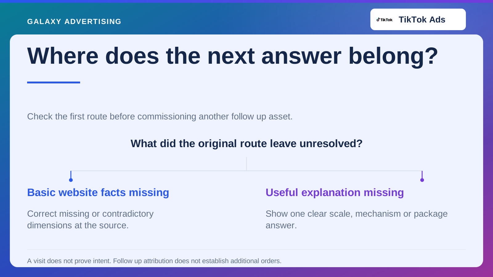
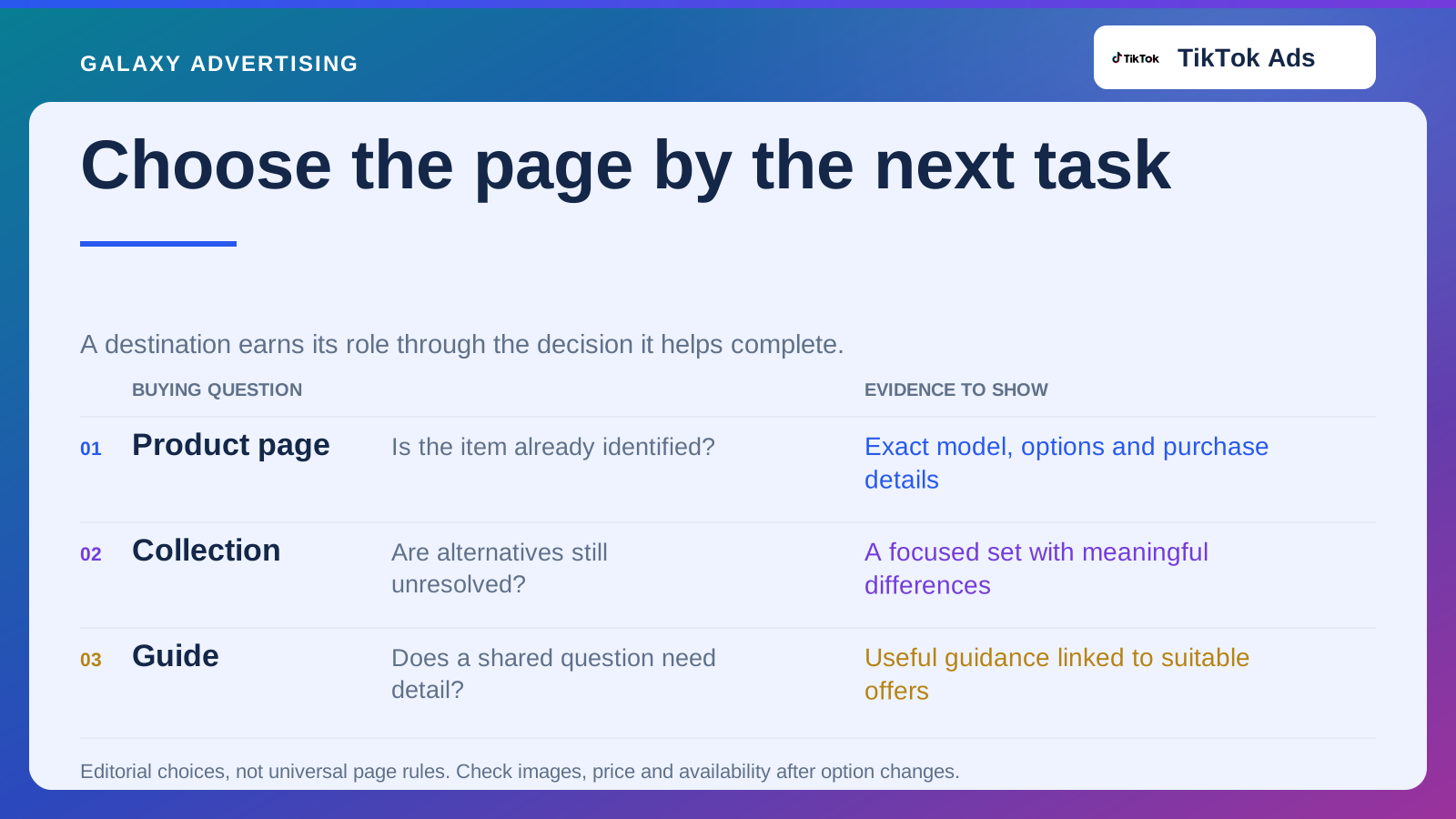
Choose the page around the next buying decision. An exact product, a focused collection or an explanatory page can each be right. What matters is what the viewer still needs to do, rather than which existing link is most convenient for your team.
Write down what the video has already told them
List the information the asset establishes. Perhaps it shows one model, size, finish and arrangement. Perhaps it introduces a use without picking a particular item. Those are different starting points for the click.
The more specific your demonstration, the more work a broad destination can add. Having the model somewhere in a large collection does not necessarily make the journey feel consistent to the person trying to find it.
Describe their next task plainly. Do they need to check dimensions, choose a compatible size or compare models with the same useful feature? Give the page that job. It makes it harder to reuse a generic destination for arguments that lead to quite different questions.
Send them to the product when the item is settled
A demonstration of an identifiable model often leaves someone investigating that item. Make its identity obvious on the product page and, where your website supports an appropriate route, retain the configuration shown.
Show the demonstrated feature in a context they will recognise. They should not have to comb through a long description to confirm that they have arrived at the right product. Accurate pictures and clear option names can help more than another version of the advert’s sales pitch.
Then answer what the short video could not. Dimensions, package contents and relevant delivery arrangements help someone judge suitability. The destination should develop the promise, rather than replaying it and leaving the next questions unanswered.
Use a collection when there is still a choice to make
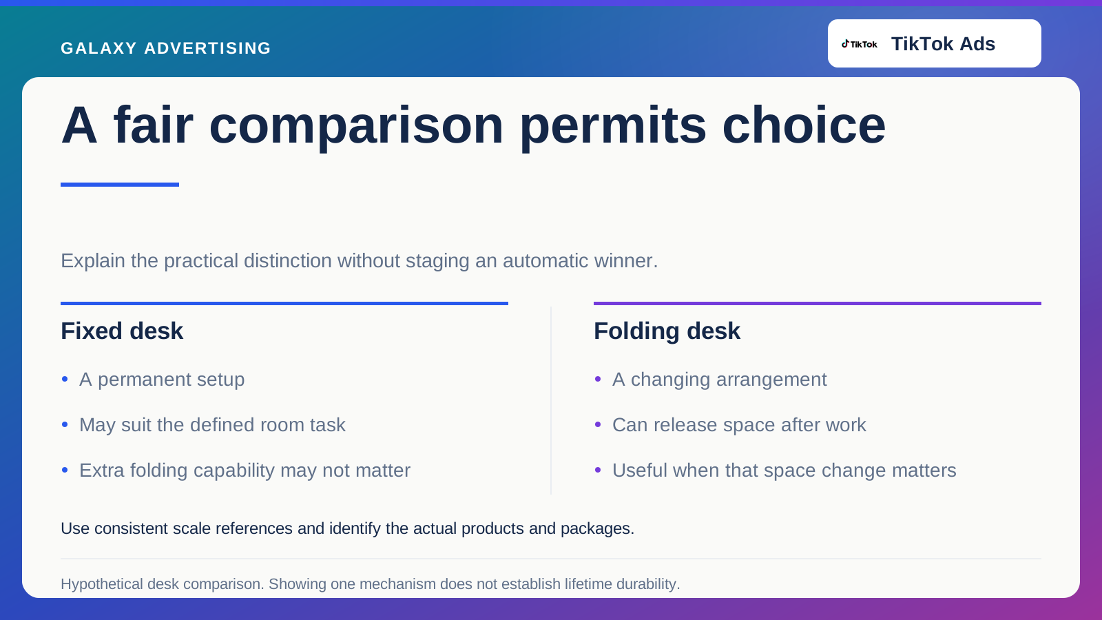
Suppose the video shows compact desks for different spaces. Several products share the characteristic that matters, so a focused collection can give the shopper a legitimate choice to explore.
Explain why those items belong together and what differences deserve attention. An internal merchandising label may mean plenty to your team and very little to the visitor trying to continue their question.
Keep the selection proportionate to the argument. Adding unrelated items for the sake of choice can make the comparison harder. You are trying to offer useful options the video has given someone a reason to consider, rather than the biggest possible product grid.
Give an explanation its own page only if it earns one
A demonstration can raise a question that spans several products. Guidance on measuring a shared working space, for example, could help someone choose a configuration before they look at individual desks.
Make the route back to relevant commercial pages clear. Otherwise the guide becomes a detour that repeats the video and sends the shopper back to searching your catalogue from scratch.
A page does not become useful because somebody calls it a campaign landing page. Another destination needs maintenance and can create competing versions of stock, price and product facts. Its distinct purpose should justify that responsibility. Where an existing page can answer accurately, improving it may be the better use of effort.
Keep the offer clear when they change an option
Check more than the first view. A shopper may select another finish, package or size, and they need to understand the resulting offer too.
Do the images, price and availability agree with the configuration now selected? The original demonstration can still help, provided the visitor can see when their choice differs from the one in the video.
For a hypothetical desk with an optional storage unit, make the base model distinct from the arrangement demonstrated. Clear package details help someone choose responsibly. An attractive opening state has limited value if exploring a realistic alternative makes the offer ambiguous.
Do the investigation on a phone
Follow the actual advert link and carry out the intended task. Find the important measurement, understand the configuration and reach the relevant next action. Try doing it without the internal knowledge that makes the catalogue familiar to you.
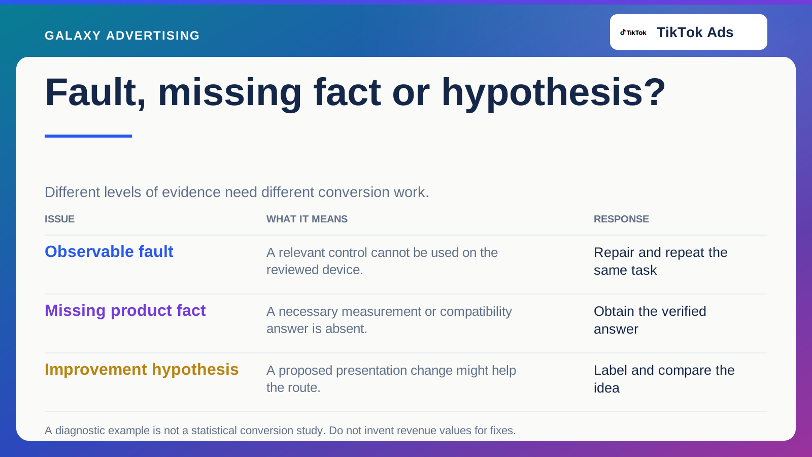
Describe any friction precisely. A hidden specification is a different problem from a slow or unusable control. Ask the website owner to verify technical concerns rather than deciding that layout caused every departure.
Check the live destination after changes. Neither a design preview nor a content document proves what shoppers now see. Your campaign owner should know which version was verified and when any material conditions changed.
Keep one approved record containing the advert, its chosen destination and the configuration under review. If the destination changes later, that record helps you check whether it still serves the same task.
Judge the page on the work you gave it
Choose observations that fit the next decision. For a focused collection, useful exploration of models may be relevant. An exact product page also needs a clear route through the appropriate options and purchase conditions.
Keep commercial outcomes in sight without requiring every visitor to order immediately. A considered purchase can involve comparison and a later return. That does not excuse a page that helps nobody progress, or justify saying that every interaction will eventually turn into a sale.
The useful destination removes work the advert has left unresolved. It takes what the shopper already knows, supplies the information needed next and joins that information to an accurately described offer. That makes page choice a consequence of your creative argument. It gives you a better basis for choosing than a blanket rule that every TikTok advert must land on the same kind of page.