Basket additions do not prove your checkout is the problem. They can mean shoppers have only just found out what the purchase will really cost or include.
Imagine a storage bed retailer with plenty of additions to basket but fewer completed orders than expected. Someone suggests a checkout redesign and a more prominent payment button. That might help. The chart alone cannot tell you whether it will.
A shopper might use the basket to discover delivery costs, compare configurations or check the total price. They could also encounter a genuine usability fault. Find out what changed between the product page and the point where they stopped, because each explanation calls for different work.
Make sure the funnel records what you think
Before interpreting the figures, check how the key events are recorded. What counts as an addition to basket? What counts as a completed order? Use a small sample to investigate obvious duplicates or gaps. A reassuring event label is not evidence that the recording is accurate.
Keep transactions separate from interactions. A person adding and removing several configurations has not necessarily created several independent opportunities to buy. Even a clean funnel can describe a complicated decision.
Compare consistently defined periods and note relevant changes. A stock shortage, a different delivery promise or a measurement update can make an apparently straightforward comparison misleading. Establish that context before deciding the website has become harder to use.
Follow the offer from first click to payment
Take one representative configuration through the journey, starting with the advertisement or collection and ending at payment. Record the product price shown, included items, delivery cost, delivery service and the options selected along the way.
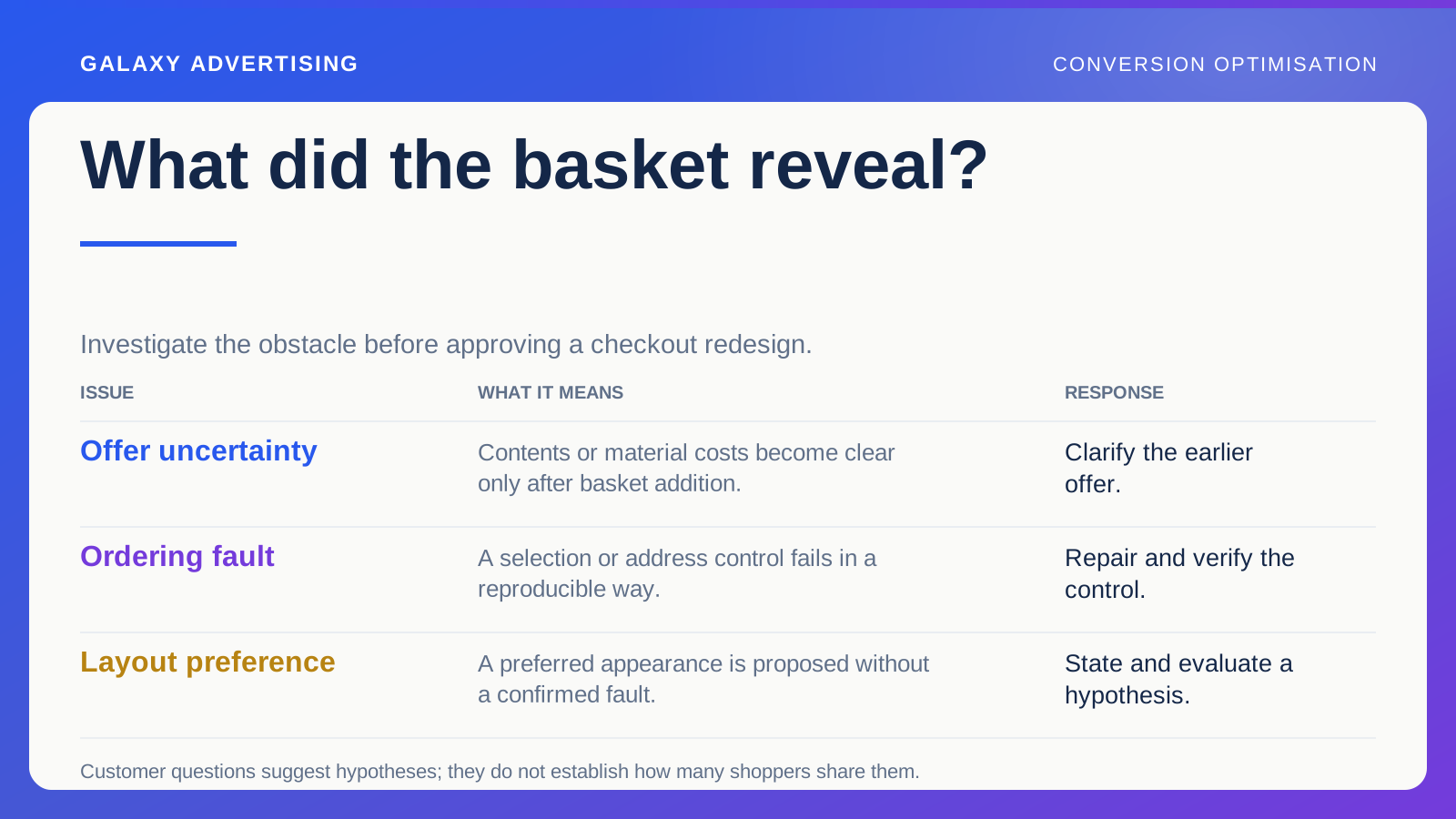
With a storage bed, check whether the mattress, headboard, assembly and room delivery are included or optional. Then note when the shopper first learns each answer. If a material cost appears only after they add to basket, that basket may be serving as a quotation tool.
That does not establish that the price is wrong. It suggests the earlier page may not give people enough information to judge the offer. Explaining the complete proposition and simplifying a form address different problems, so expect them to change behaviour differently.
Separate product questions from ordering faults
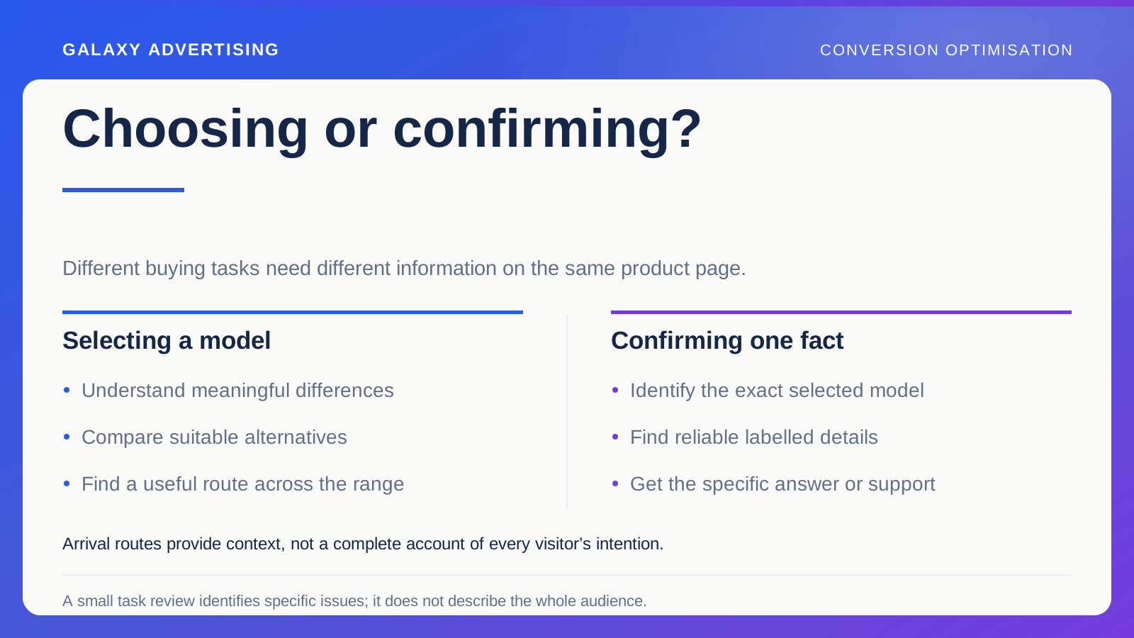
Collect recurring questions from people who have already looked closely at the product. Listen for the difference between suitability and ordering.
“Will this bed fit my mattress?” is a product decision. “Why will the postcode field not accept my address?” is a functionality question. A compatibility explanation cannot repair that field. A faster form cannot tell someone what they are buying.
Treat these as separate hypotheses. Customer conversations help identify plausible problems, but they do not give you a reliable prevalence calculation. A handful of enquiries can expose an important omission without proving every departing shopper shared the concern. Use the question to guide investigation, rather than turning it into a universal diagnosis.
Repair a fault before testing a preference
Check the controls used to choose and buy the product on the devices customers use. Try option selection, validation messages, quantity changes and movement between stages. When an error occurs, does the message explain how to recover?
A reproducible fault can usually be handled as a repair. A preferred layout needs a hypothesis and proportionate evaluation. Otherwise every aesthetic opinion risks entering the audit as a supposedly confirmed revenue problem.
Check the wider consequences of a correction. Something that works for one configuration could behave differently with an optional service or an unavailable product. Verify the relevant variations. One successful demonstration does not settle how the whole buying route behaves.
Test a clear explanation for the hesitation
Suppose the evidence points to uncertainty about what is included. You could place a clear contents summary beside the product options, linking to the relevant delivery and assembly information.
Write down the expected benefit first: suitable buyers should understand the offer earlier and meet fewer surprises later. Choose observations that could support or challenge that explanation. Depending on available volume, these might include relevant questions, progress towards ordering and completed transactions.
If you want to learn whether the clarification helped, avoid changing price, imagery, the range and checkout at the same time. When a controlled test is impractical, make a structured comparison and describe what it cannot establish. A useful finding can have limits without becoming useless.
Give the next team something precise to fix
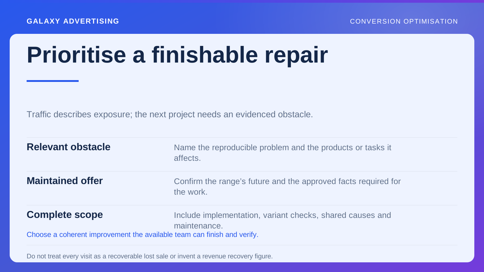
“Checkout needs to convert better” does not tell a developer or merchandiser what to do. Record the actual observation and its consequence. If you found that mattress inclusion becomes clear only at a later stage, say so for the selected bed package.
Identify the configuration, the missing explanation and the person who can verify the contents. Then separate the repair from the hypothesis. Correcting an inaccurate statement is a factual repair. Finding out whether an earlier, clearer contents summary changes purchase behaviour is a separate evaluation.
That distinction gives development a clear request and stops marketing claiming an unmeasured result. After implementation, check the page and other configurations using the same template. A ticket marked complete is not the finish: the relevant offer must be represented correctly, and you must be able to interpret the proposed evaluation.
Judge whether the whole decision improved
Fewer additions to basket are not automatically bad. Clearer information could help unsuitable visitors recognise a limitation earlier, while completed suitable orders remain healthy. More additions can be commercially weak if they simply push disappointment further along.
Look at completed purchases alongside support questions, cancellations and the operational consequences your business can see. Keep product availability, traffic mix and promotions in view. Every movement after a page change does not belong to that change.
Retain what you learned and why. Otherwise a later redesign may remove the useful explanation because somebody prefers a cleaner page.
The purpose is to remove avoidable obstacles for people who can make a suitable purchase. A checkout redesign earns its place when it solves an evidenced problem. Moving the payment button is an expensive distraction if the shopper still cannot tell what comes with the bed.