Clear, accurate product copy can still leave the buyer's main question unanswered. A projector retailer can polish a description and add attractive images while customers keep asking whether the model works with equipment they already own.
The words may be perfectly readable. They are just spending their effort on features the shopper already understands.
Before asking for more copy or a more elegant design, identify the unresolved decision. A hesitant visitor does not necessarily need stronger persuasion. They might need a specific fact that lets them work out whether this is the right purchase at all.
Look at what brought them to the page
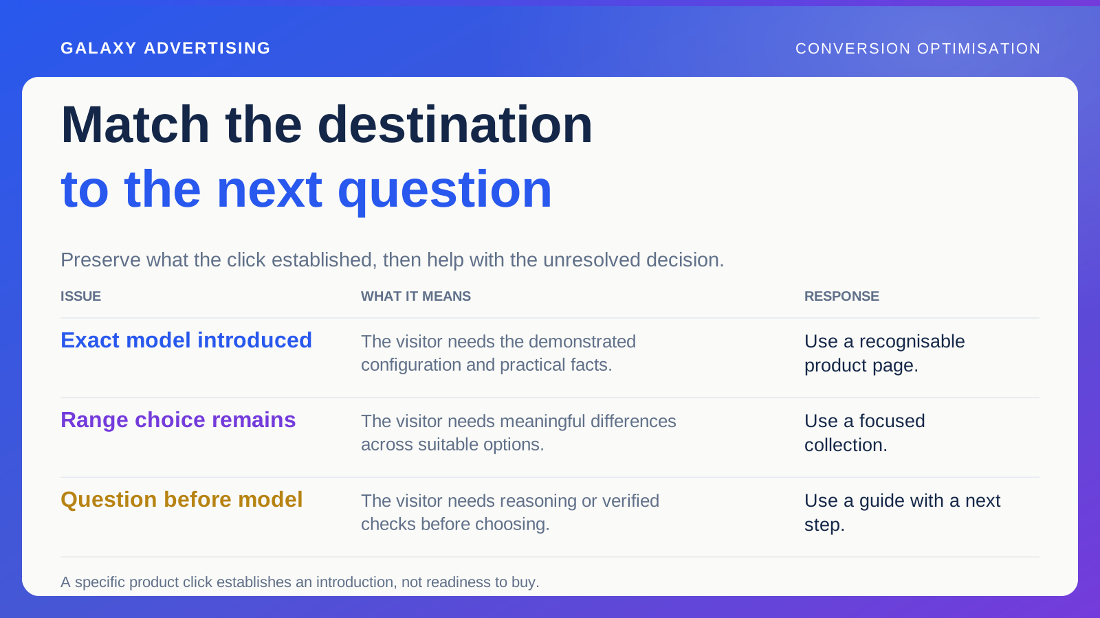
Inspect the messages and routes introducing the product. An advert for a specific configuration sets up a different expectation from a broad collection link or a technical question in a guide.
Write down what the route has already established. Someone arriving from an exact model demonstration should not have to identify that model again among visually similar options. Someone arriving from a broad category could still need a useful comparison before settling on an item.
The source of a visit is context, not a complete psychological profile. It cannot prove that everybody arriving that way has the same intention. Ask what information the route has made relevant and whether the destination carries that task forward coherently.
Keep customer questions attached to their context
Use actual enquiries, support conversations and appropriate task reviews to find uncertainties. Keep the product reference and any context that matters. The same words can describe different problems with different configurations.
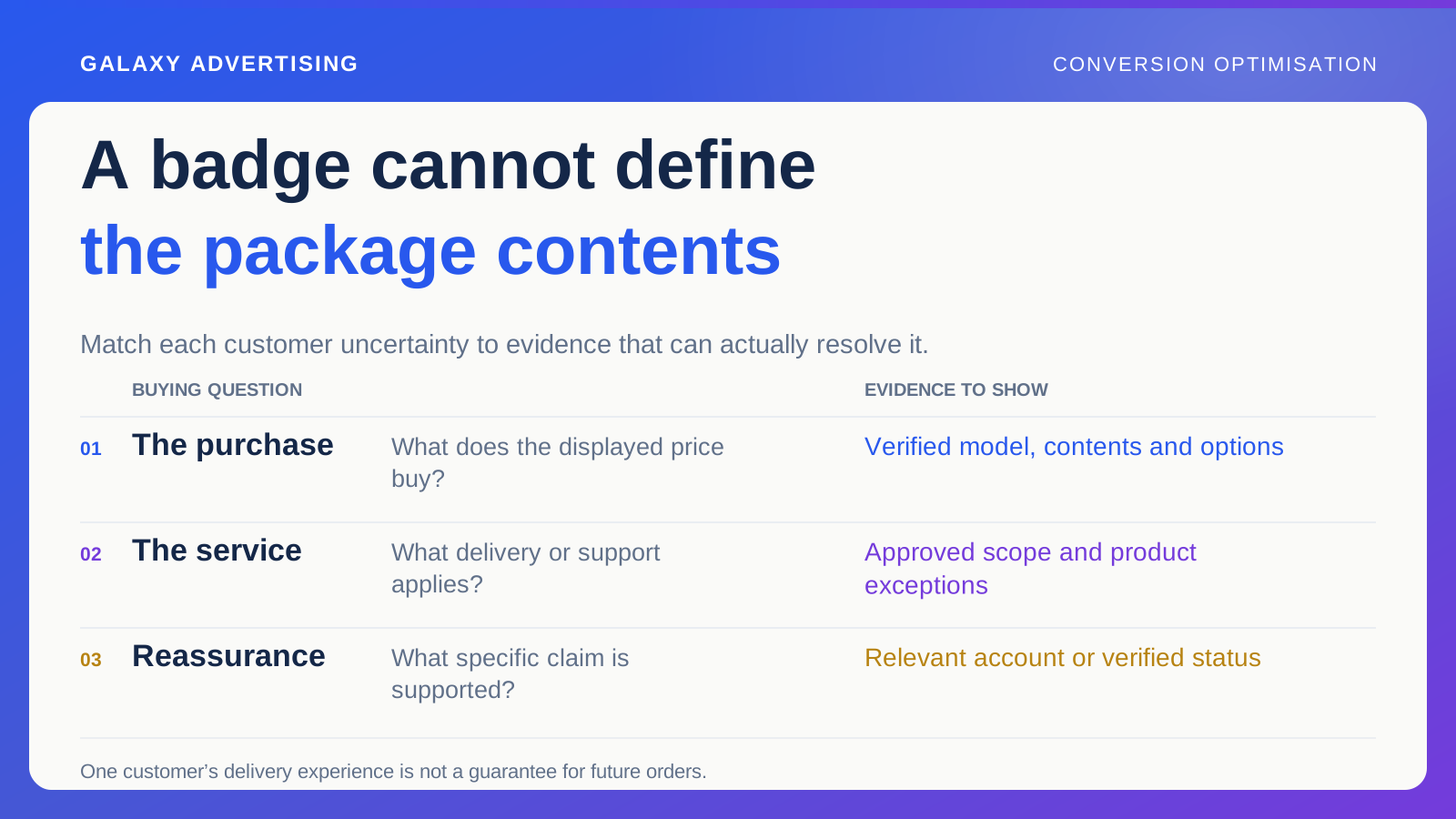
Separate a request for information from an objection to the offer. Someone asking whether an accessory is included could simply be comparing packages. Someone who understands the contents and finds them unsuitable needs a different answer.
Several enquiries can reveal an important omission. They cannot establish how common it is across every visitor. Their immediate value is showing a question the page should help a suitable customer resolve. Resist turning that into a universal explanation for abandonment.
Are they choosing, or checking one fact?
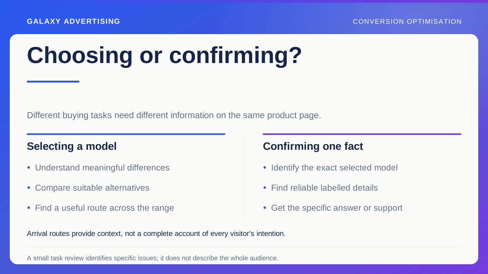
Some shoppers need to select between alternatives. Others already prefer a model and want to confirm something specific. Both tasks can happen on the same page, but they need different help.
Selection needs meaningful distinctions between options. Confirmation needs reliable references, clearly labelled details and a direct route to the answer.
A general comparison feature will not necessarily resolve an unclear selected state. Equally, adding more product detail may leave shoppers stuck if they cannot understand which differences matter across the range. Diagnose the task before deciding the page's next useful job. More information is only helpful when it addresses the decision in front of someone.
Put the answer where it becomes useful
Work out where the information informs the choice. Package contents might belong beside the relevant option controls. A deeper explanation can have a clear route of its own without competing for exactly the same visual space.
You do not need every fact above the purchase button. That can make the page harder to use. Give priority to what someone needs to understand the current choice, then make further detail predictable to find.
Check the wording against its source. A prominent answer that oversimplifies a condition can create a stronger misunderstanding than a less visible, accurate answer. Reduce the work of finding and understanding the fact while preserving the meaning and conditions that make it correct.
Give the harder question a sensible next step
Some questions need model specific manufacturer information or an individual response from the appropriate team. A standard paragraph cannot resolve everything.
Make that route clear and, where appropriate, carry the relevant context into it. An enquiry retaining the exact product and selected configuration, meaning the chosen size, colour or setup, is easier to answer than a general message asking whether the furniture is suitable.
Keep ordinary verified facts available directly. Asking people to enquire about every dimension or package detail adds work for the customer and support. Reserve individual help for questions that genuinely need it, with dependable general information accessible on the site.
Ask someone to complete the actual task
Give a reviewer a realistic question and ask them to establish the answer from the page. Watch the route they take without supplying the product knowledge your team already has.
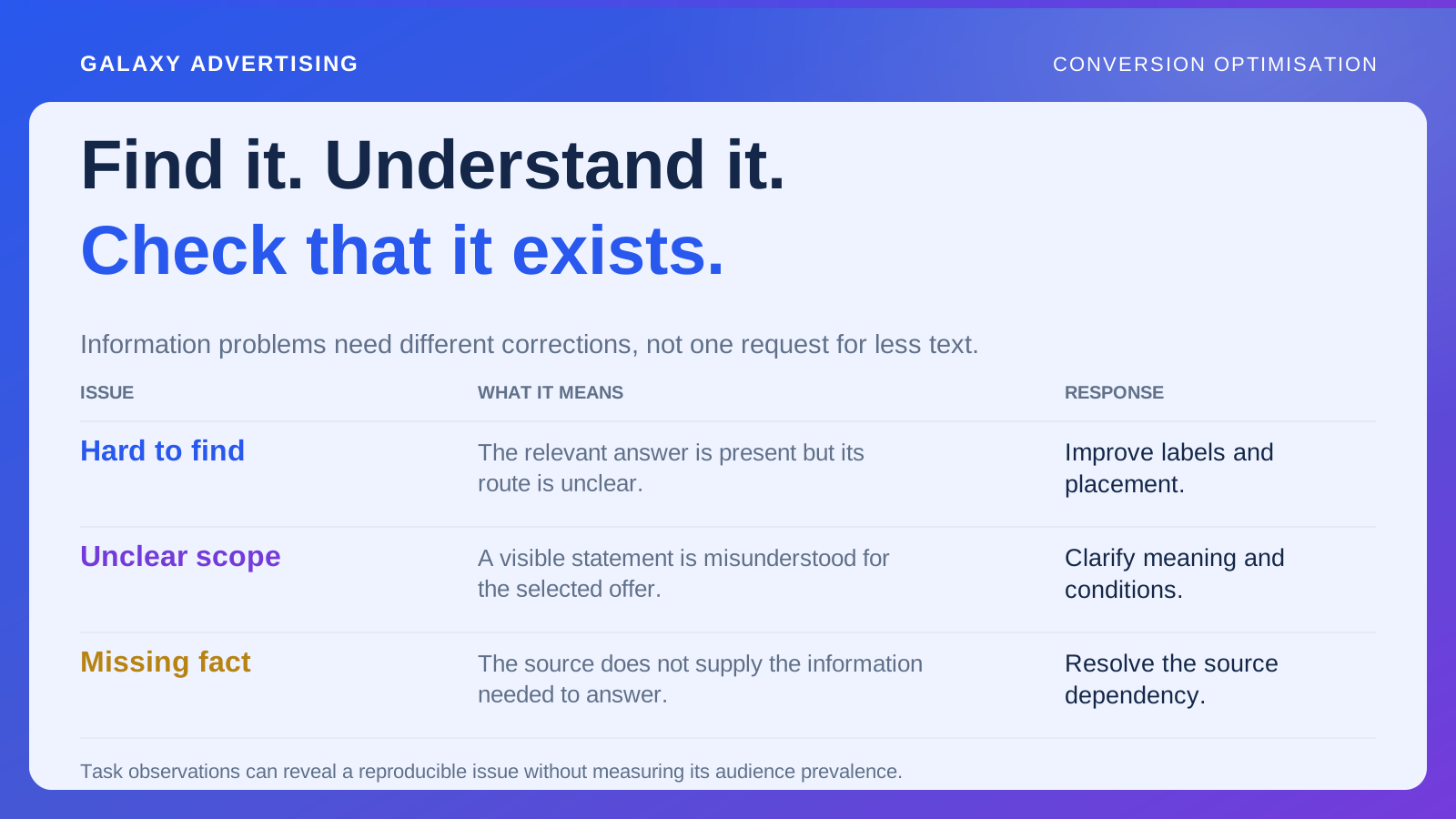
If they locate the answer but misunderstand its scope, inspect the wording or configuration identity. If the fact is missing, resolve the source dependency before redesigning where it goes. If it is correct but hard to find, presentation becomes a more plausible target.
A small task review cannot predict your whole audience's behaviour. It gives you specific observations you can verify and act on. That is a much clearer starting point than telling somebody to make the product page feel more convincing.
Try arriving with a different question
Inspect the same product through two plausible routes. One customer follows an exact model advert. Another arrives after reading a broad guide. Ask what each route already explained and what remains unanswered.
You may discover why one general introductory block does not serve both equally. That does not require identifying every visitor or building a complicated personalised experience. Clear product identity, predictable detail and relevant links could be enough for both tasks.
Record the difference in the brief. Later edits should not remove a useful route while improving another. If the journeys genuinely need materially different destinations, explain why through the customer task. One template is not inherently more professional than another. The purpose is a coherent next step, rather than a bigger collection of pages offering almost identical answers.
Notice when the customer's next question changes
After a correction, inspect relevant enquiries and whatever purchase evidence is available. People might understand the original issue and start asking something more detailed. That can reveal the next task, rather than prove the improvement failed.
When reading commercial movements, keep availability, acquisition messages and the offer in view. A clearer page cannot isolate its own effect from every other trading condition.
Retain the original question, its source and the completed change in the decision record. Future editors then know why the information exists before deciding it looks like clutter. The best answer on the page is the one that helps with the customer's actual decision, even when it is less convenient to write than another paragraph about features.