What if the advert has already introduced the exact table, but your landing page makes the shopper find it all over again? An extending table demonstration can send someone into a large dining collection containing several unrelated styles.
They must recognise the item, establish which version appeared and find its dimensions. A well designed collection has still given this particular click unnecessary work.
Start with what the customer already knows. Preserve useful context from the advert or link, then supply what the next decision needs. One destination will not serve every product, message and stage of comparison equally well.
Write down what the click has already established
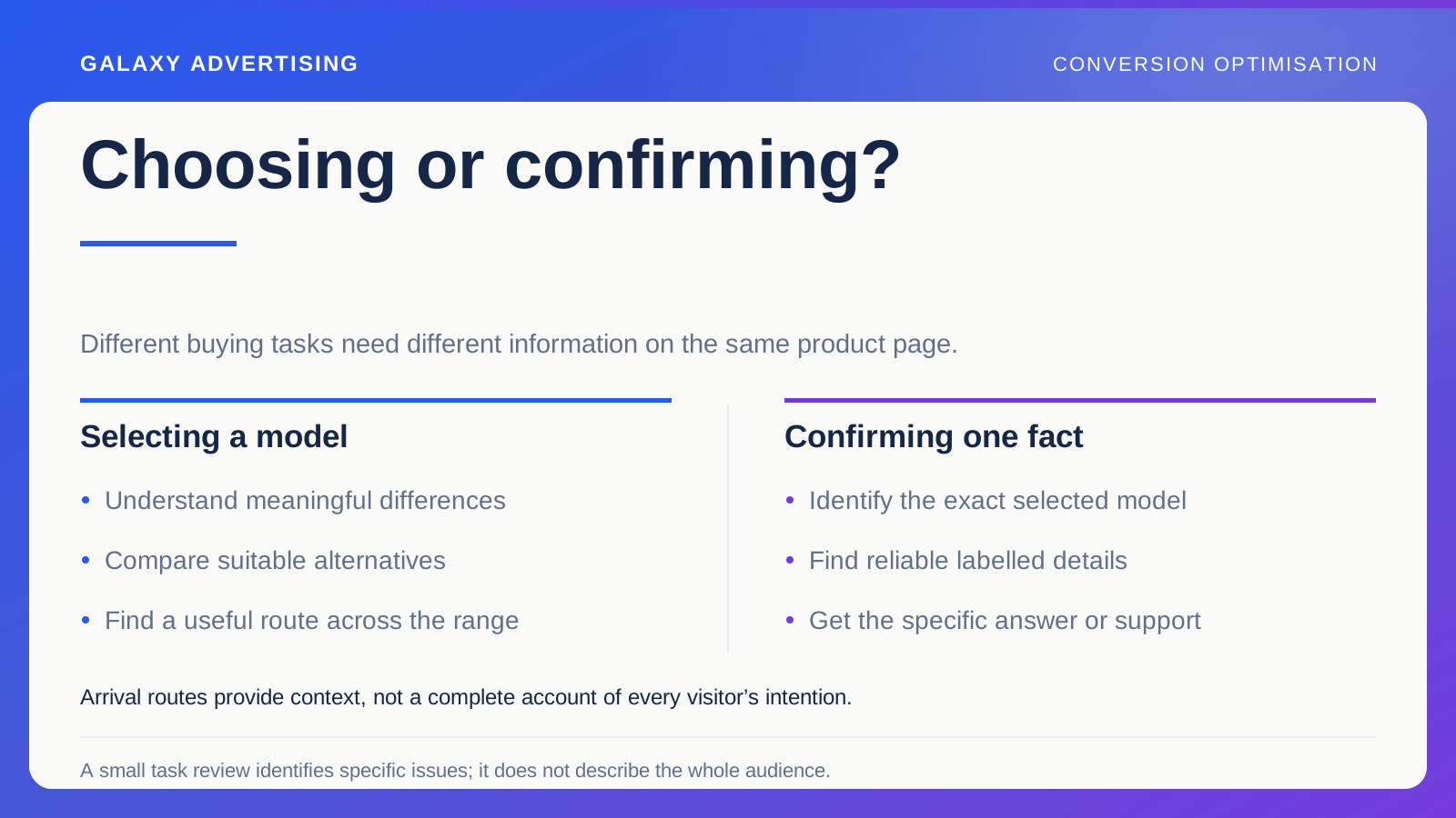
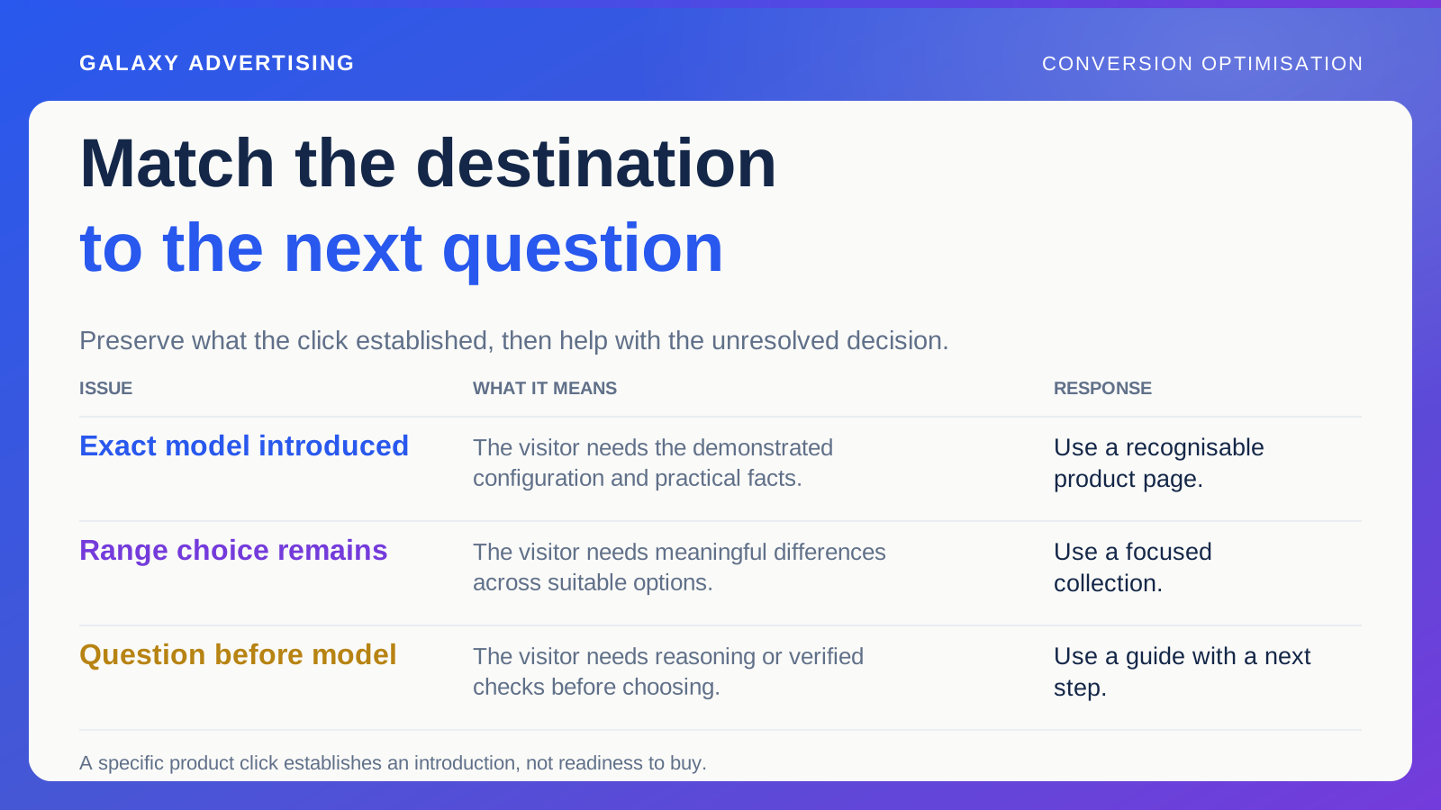
Record the message, product reference and promise preceding the visit. Distinguish an exact model introduction from broad category exploration or investigation of a practical question.
Do not read complete intent into the source. Someone clicking a specific product advert could still be researching. You know they have been introduced to that offer, rather than that they are ready to buy it.
Name the next unresolved question. With the extending table, it might be the actual dimensions in each arrangement. That gives the destination a purpose. It also helps prevent a broad introductory page from replacing the information someone now needs. Carry forward what the click established instead of asking the visitor to start that work again.
Use the product page when the model is established
An advert about a particular model usually needs a destination where that model is recognisable. Check the selected configuration, image, price and availability. A generic product URL does not necessarily open in the intended state.
Make important information findable. You do not need to replay the entire advert, but the page should continue its argument and let the shopper check the practical implications.
When versions share a page, explain their differences clearly. Someone should not need to infer which option appeared in the demonstration. Their existing context should make the next task easier. If the destination makes them question whether this is the same offer, the route has lost part of the work the advert already did.
Use a focused collection for a range decision
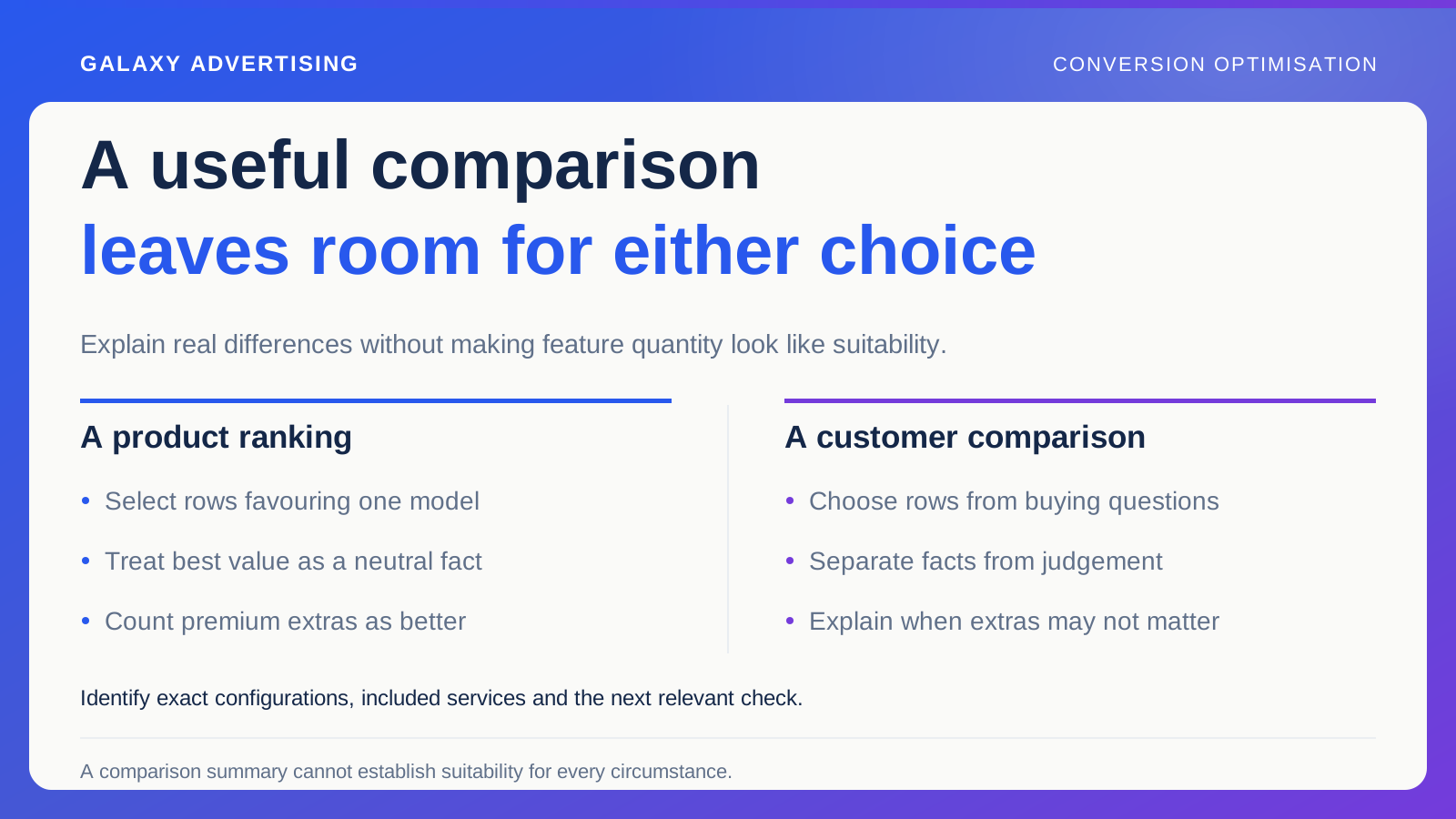
A collection helps people compare suitable options when no exact model has been established. Organise it around meaningful differences, alongside the retailer's internal category labels.
A hypothetical collection for compact dining spaces could show relevant dimensions and configurations. That fits a space focused category message more coherently than sending everyone into a general catalogue containing every table you carry.
Avoid making the selection so narrow that its purpose becomes obscure. Explain what the range is for and keep useful routes to alternatives. Customers with different requirements should understand the limitation without assuming you have no suitable offer at all. A focused destination should help them make sense of the selection, rather than conceal the wider choice.
Use a guide when the question comes before the product
Some clicks bring a task such as measuring a room, understanding a configuration or comparing materials. A guide can help if it advances that decision and connects accurately to an appropriate range.
Give the guide a distinct role. Longer versions of product descriptions do not necessarily help. Identify the practical reasoning the reader needs and what they should establish before opening a product page.
Keep technical and suitability guidance within verified sources and the business's competence. Marketing copy should not improvise manufacturer instructions. Sometimes its useful job is identifying the checks and directing people to authoritative product information, rather than pretending to settle every technical question itself. The guide can prepare the decision without overreaching.
Make the next page continue the same decision
A guide should offer a relevant next step. A collection should make differences inspectable. A product page should link to supporting explanations when someone needs them.
Choose links for the decision they continue, rather than a shared keyword. A room measurement article could lead to a relevant collection and the dimensions shoppers need to compare. It does not need to tour every service page on your website.
Check the final click preserves context. If a guide discusses an extending model, its product destination should identify the right version. An otherwise coherent editorial route can still fail when its last link opens an unrelated default configuration. Follow the route all the way through before approving it.
Walk the full journey on a phone
Start with the source message and move through the destination to the next practical action. Is the advertised item recognisable? Are essential conditions understandable? Do the controls work in the space available?
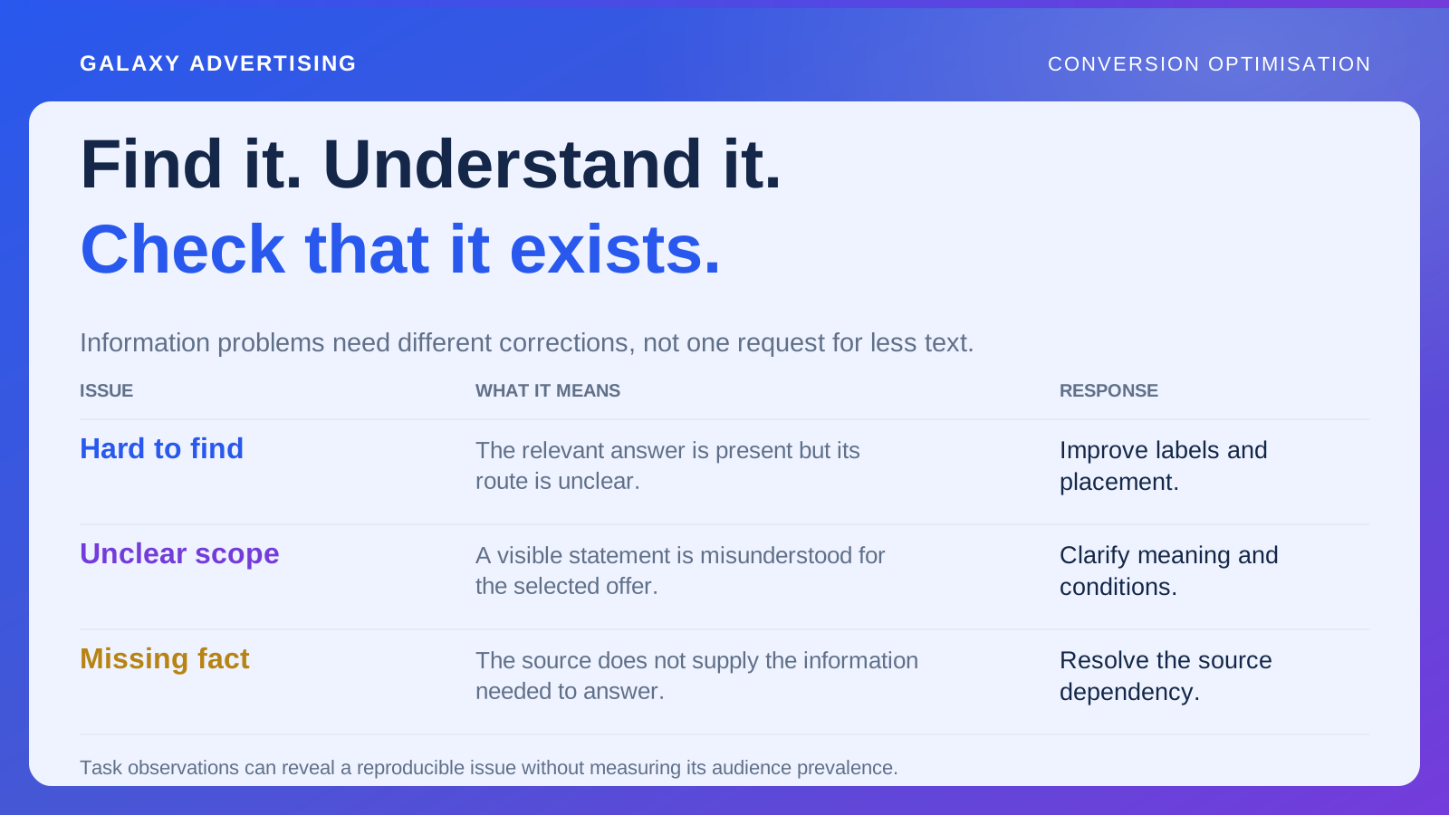
Inspect overlays, sticky elements and expandable content. The right answer can technically exist while being difficult to reach or read. Record the specific obstacle you observe, rather than simply preferring a shorter page.
Ask somebody unfamiliar with the brief to explain the offer and what they would inspect next. That gives you a useful clarity check. It does not represent every customer's behaviour or predict the campaign's conversion rate, so keep the conclusion appropriate to the review.
Judge the destination by the job you gave it
Choose observations suited to its role. A guide could help someone build a suitable shortlist. A product destination could clarify the demonstrated configuration. Supporting interactions tell you about the route, rather than automatically proving a sale caused by that page.
Review enquiries, product progression and orders alongside traffic, stock and offer changes. A destination comparison becomes harder to interpret when the promoted range changes materially at the same time.
Keep the reasoning behind the choice. When a future campaign makes another argument, reconsider the route instead of automatically reusing the most recent page. A useful landing page meets the question carried by the click. It leaves the customer doing the next necessary piece of work, rather than repeating something they had already understood.