 Google Ads
A page full of relevant products can still make somebody who searched for an exact model start choosing all over again.
For you, the merchandise is relevant. For the visitor, the route has gone backwards. The opposite happens when a broad suitability question lands on an arbitrary product: you've supplied an item before answering the question that would help them choose it.
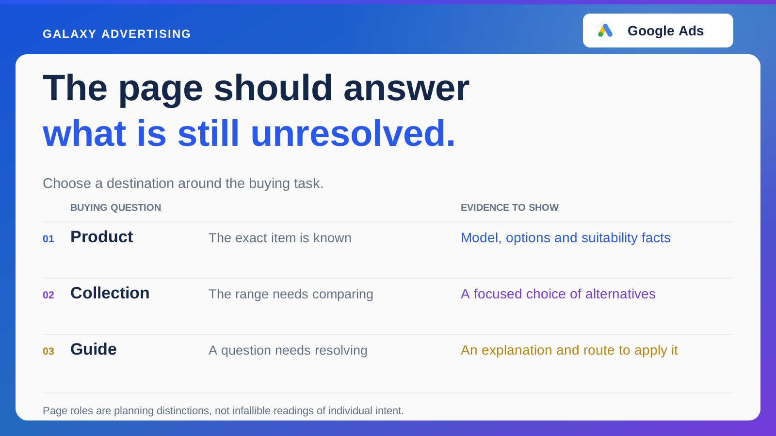
Choose the destination around the promise and the unresolved decision. The point is to help customers continue their work, rather than declare one page type the winner for every situation.
What has the message already settled?
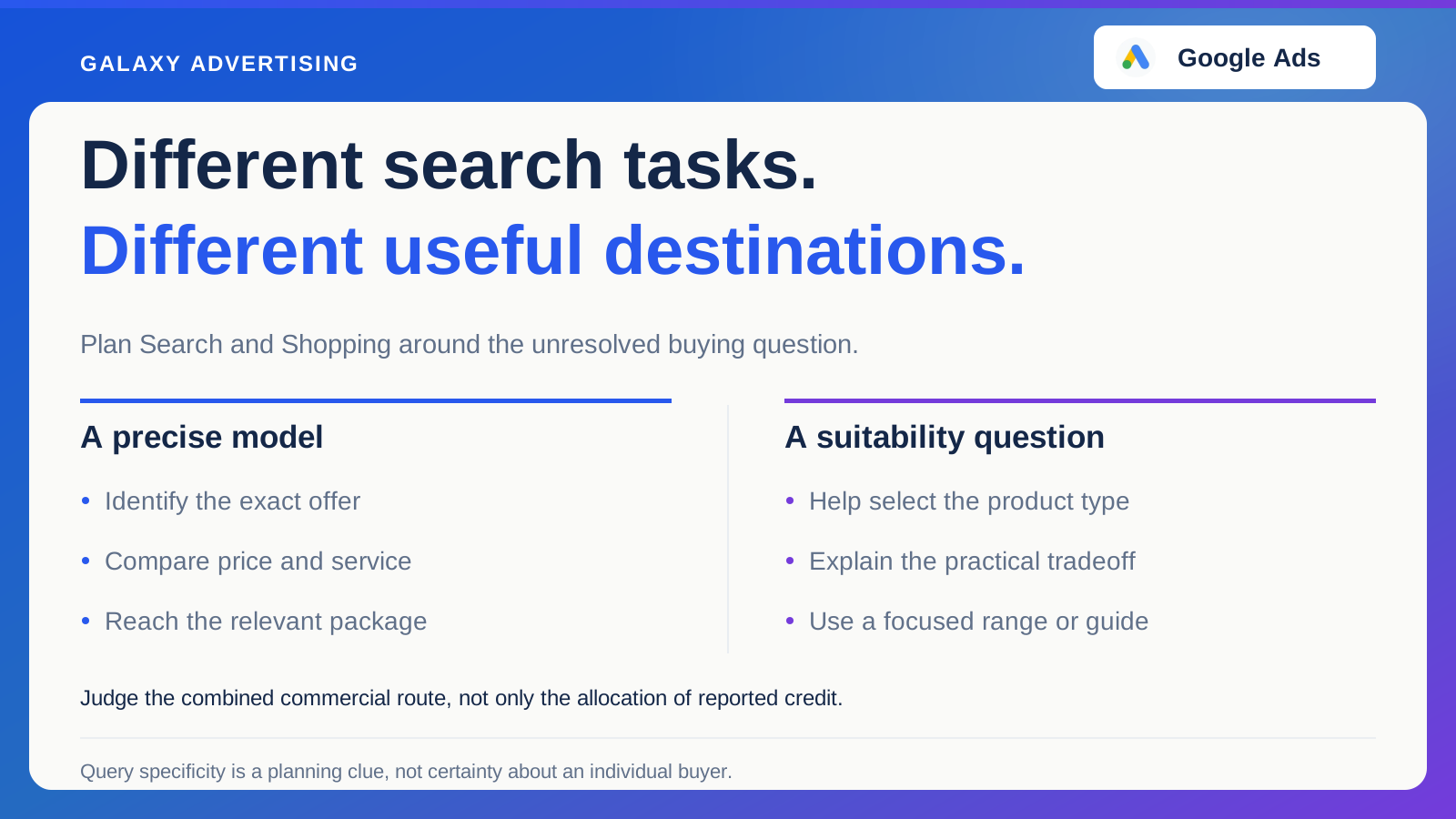
A precise model search can suggest the shopper has narrowed the range. A broader use case can leave selection open. Treat these as planning clues, not infallible readings of an individual person's intent.
Read the advertising message beside the query context available in the account. If you promise a specific item or configuration, make it identifiable immediately after the click. The customer shouldn't have to deduce which part of the range your message meant.
Don't give a generic destination contradictory jobs because it's convenient to maintain. Reuse a page when it serves the task well. The reason needs to make sense from the customer's side, rather than rest on an internal preference for fewer pages.
Use the product page when this item needs assessing
A product destination should confirm the model or item shown, explain relevant options and give the facts needed to judge suitability. Make the selected configuration and price understandable.
Inspect the route on a phone as well as desktop. A technically correct link can still be confusing when option controls or essential information are awkward to use. Checking the link alone doesn't establish a usable buying route.
A longer page isn't automatically better. Can the visitor find the measurements, contents, availability and commercial conditions they need without unnecessary work? That's a more useful test than how much copy the page contains. Length can give an answer space, but it doesn't guarantee the answer is findable.
Use the collection when the alternatives still need comparing
A collection helps someone choose among relevant options. Give it a clear organising principle and useful distinctions, such as size, configuration or intended use.
Don't send someone into an excessively broad range containing unrelated products. A focused collection should reduce the selection problem. Otherwise, you're handing the whole task back to the customer after paying to bring them in.
Keep guidance near the decisions it explains. A concise comparison or link to a useful guide could help more than a long introductory essay pushing products out of view. Support the comparison where it happens, rather than making people read around the range before they can see it.
Use a guide when there's a question to resolve first
A measurement process, compatibility distinction or practical tradeoff can need more explanation than a commercial listing efficiently provides. That's a job a guide could perform.
Answer the question and give a clear route to applying the answer. A lightly rewritten collection description created to provide another URL doesn't do that work. The guide needs a distinct reason to exist from the customer's point of view.
Be careful about its commercial role. Useful content can attract early research while still being unsuitable as a paid destination for some budgets or buying situations. Assess it against the campaign objective and cost. Being helpful is necessary for a useful guide; it doesn't automatically justify paying for every visit to it.
Check that the promise is still recognisable
Follow the actual advertising link and inspect imagery, price, configuration and service claims. Keep important qualifications accessible near the statements they explain.
Mismatches can be subtle. The image could show an extended version while the price concerns the smallest option. A service message could apply only to certain orders. Your team understands the range. The page needs to make those distinctions understandable to someone who doesn't.
Where campaign settings influence the selected destination, check current behaviour and documentation. Planning a route doesn't verify the experience actually produced. That needs inspection, especially when your intended page isn't the whole story of how the destination is selected.
Test the destination without quietly testing a different offer
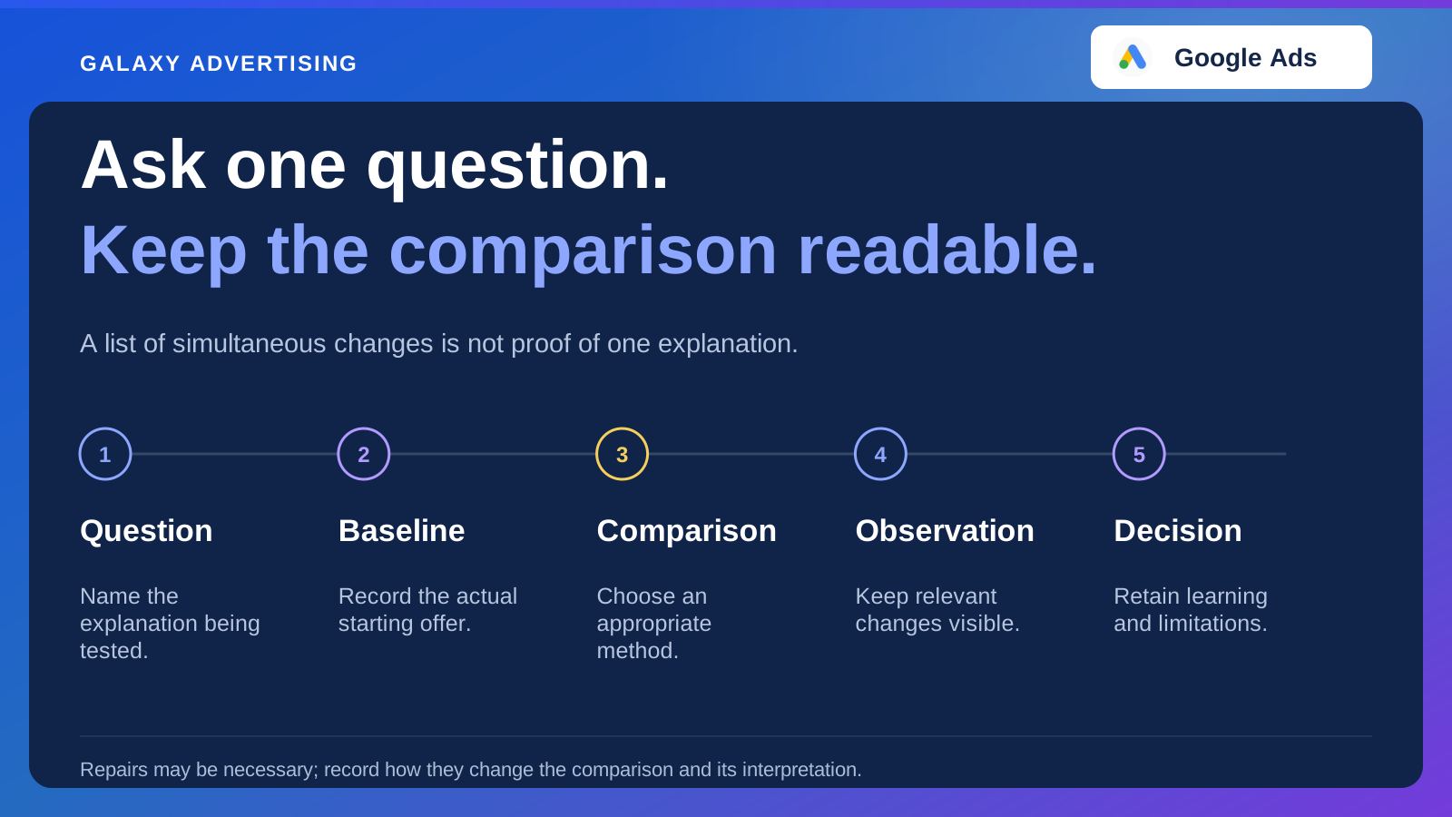
If you compare a product page with a focused collection, specify the customer task and outcome that would justify the difference. Keep the promoted proposition comparable where possible.
A more attractive product mix, different incentive or changed availability can affect results independently of page type. Record them rather than giving layout or destination choice all the credit. Otherwise, you risk repeating a page decision when the commercial difference did the work.
Read commercial outcomes alongside useful intermediate observations. A destination could produce fewer superficial interactions while helping more suitable visitors decide clearly. Explain what the activity was intended to achieve before judging which result matters.
Write down what the destination owes the visitor
Describe what the message promised, which question remains and where the chosen page answers it. Include exact product or range, relevant configuration and intended next action. This creates a small destination agreement you can keep with the campaign brief.
Ask a colleague unfamiliar with the campaign to follow the route and explain the offer. Difficulty could reveal an unlabelled option, missing distinction or a link sending them backwards. Record that ambiguity instead of commissioning a general redesign before you know the problem.
Now check another query or message using the same page. If its task differs materially, decide whether the page truly serves both or needs an alternative destination. Visual appeal doesn't establish that the customer's actual promise has been completed.
Choose a page you can keep accurate
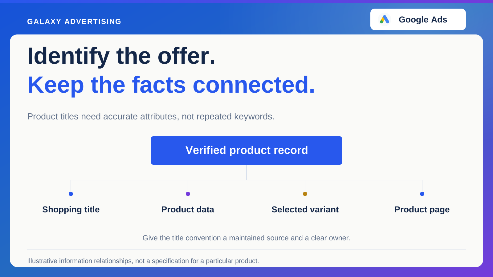
A dedicated destination becomes a liability if facts, prices or links fall behind the main catalogue. Assign an owner and identify the information that needs synchronising.
Sometimes clarifying an existing page is more practical than commissioning another. Sometimes a focused destination has a distinct job worth maintaining. Your offer and operating process decide, rather than a universal rule about landing pages.
A buyer has already done some work before reaching you. The right destination respects it: confirm what they know, help with what they don't and give them a sensible way forward. A persuasive page shouldn't need them to start again.