 Meta Ads
What if someone taps your compact extending table demonstration and lands in a broad dining collection, with no obvious sign of the item they just saw? You've provided a relevant category. They've lost the particular product story that made them interested.
The team knows which table appears in the video. A new visitor doesn't arrive with that knowledge.
Message continuity means connecting the reason to click with the information available afterwards. You don't need to copy every advert line onto the page. You need to make the represented product, promise and next practical decision easy to recognise.
What will they remember from the advert?
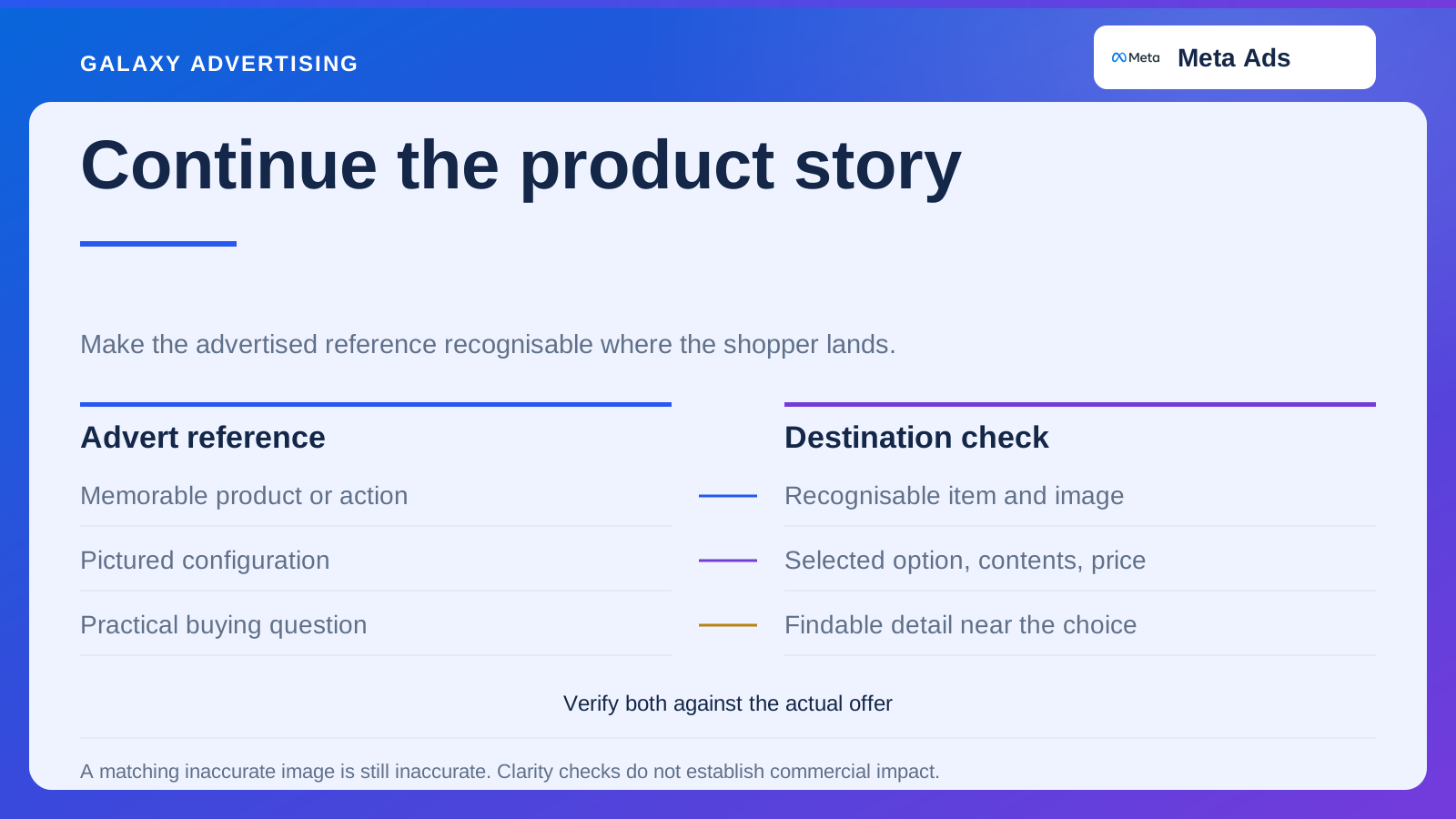
Record the reference your advert makes memorable. It could be a product action, room arrangement, finish or defined package. The destination should help the visitor recognise that particular reference quickly, rather than ask them to start their search again.
Don't assume they remember the model name. Your production team might use it throughout the project while the viewer remembers an extending mechanism or compact shape. An accurate image and clear product identification can bridge the difference.
Ask an unfamiliar reviewer to follow the route and describe what they think was advertised. This is a practical clarity check, rather than a representative study of every visitor. If they can't identify the item without help, you've found a continuity problem somebody can act on.
Choose a page that helps the next decision
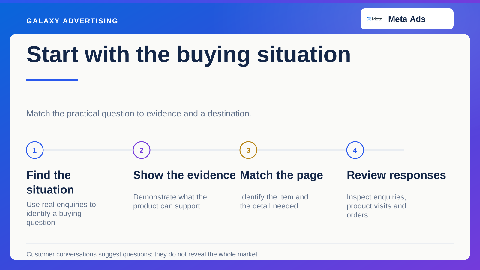
A specific model demonstration will often need a route where that model and its relevant configuration are easy to assess. A genuine range comparison might need a focused collection. A question that needs explaining may deserve useful guidance linked to suitable products.
Those are editorial and merchandising choices, rather than universal rules for page types. The useful destination depends on the promise you've made and what the person needs to do next. Let the buying decision guide the choice.
Be wary of a custom landing page that mostly repeats promotional language before sending people elsewhere for basic facts. An extra page can add complexity without answering anything. An organised existing product page may offer a clearer route than a separate campaign page with incomplete information.
Make the pictured configuration clear
After the link opens, check the selected variant, meaning the chosen size, colour or configuration, along with its image and displayed price. If the advert shows an optional arrangement, make it clear how to select it and what it includes.
In a hypothetical table video, you might show the extended form with six chairs, while the base product contains only the table. The page needs to explain that distinction intelligibly. Shoppers shouldn't have to deduce the package from fine print or recognise accessories belonging to another collection.
Repeat the checks after changing options. Image, availability and price should still describe one coherent selection. A correct opening state doesn't prove later interactions remain understandable, especially on a phone where controls and labels occupy less visible space.
Put the answer near the buying task
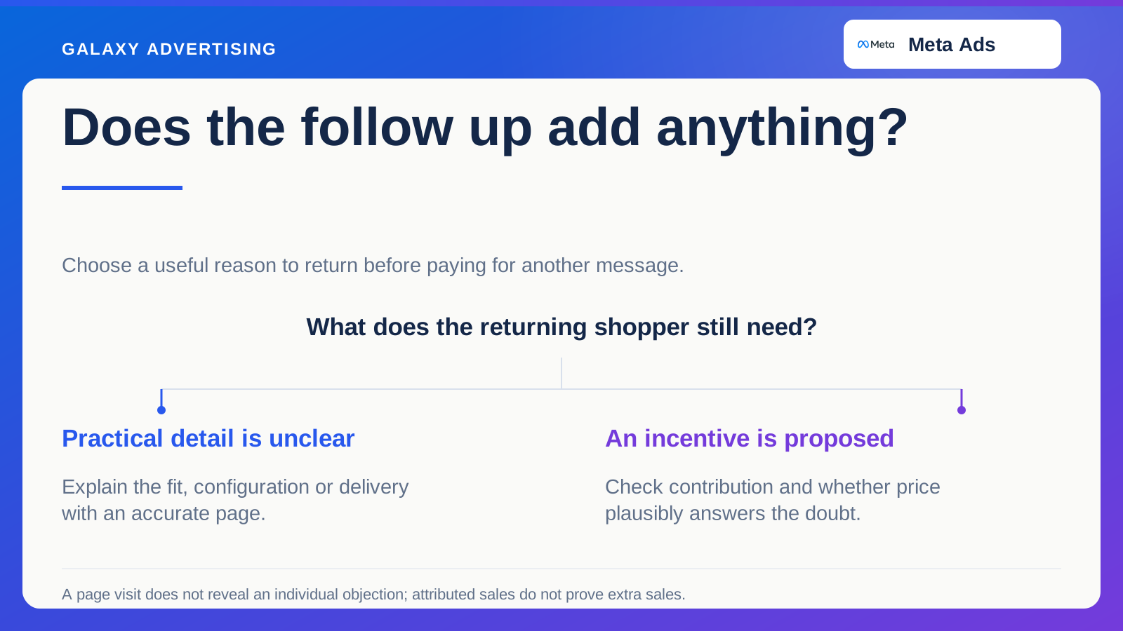
Identify the practical uncertainty your advert is likely to create. Showing scale can prompt a measurement question. Explaining material can lead to finish comparison. A package offer can make somebody check which components are included.
Put a clear route to that information where the customer evaluates the relevant option. Don't scatter essential facts across unrelated pages just because different teams originally created them. The customer experiences one decision, regardless of how your work was divided internally.
Concise presentation isn't the same thing as missing detail. The first screen doesn't need every specification. It should make important information findable and label it accurately. A short page with an ambiguous heading can be harder to use than a longer page with a clear structure.
Keep the visual handover truthful
Use references that preserve the appearance of the advertised item. Different lighting or styling can be acceptable. Unexplained changes in colour, proportions or included objects can make recognition difficult and leave the visitor unsure what they're looking at.
If generated supporting scenery appears in the advert, verify that the destination still corresponds to the actual product. An appealing scene mustn't create a configuration the store cannot supply. The supporting image needs the same factual discipline as the product page.
Copying an inaccurate image onto both stages doesn't solve continuity. It just makes the misinformation consistent. Use the verified offer as your reference, then check both creative and destination against it.
Try the route in ordinary mobile use
Open the page, identify the item, inspect relevant options and find essential service information. Note overlays, unexpected jumps and controls that hide the current selection. Follow the task far enough to understand where a real interruption occurs.
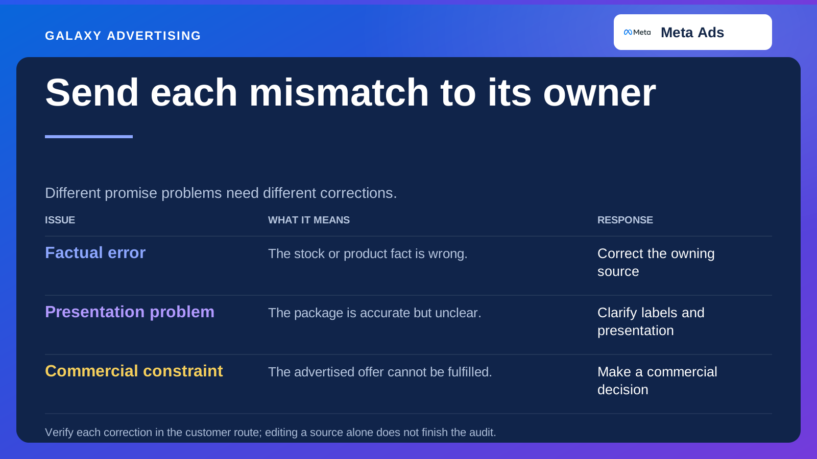
Separate verified obstacles from improvement ideas. If a control fails, document reproduction steps. If you suspect a different information order would help, call it a testable proposition rather than an established conversion defect.
Include accessibility and comprehension. Clear labels, readable text and usable controls support the buying task without requiring an elaborate campaign experience. Familiarity with the layout shouldn't be a condition of understanding the page.
Bring the product data owner into planning. A destination can become inaccurate when merchandising updates a variant while promotional copy is manually maintained elsewhere. Identify which facts should follow the product source and which need separate review. That reduces duplicated maintenance and gives people a clear place to correct inconsistencies, rather than expecting an editor to remember several disconnected descriptions.
Judge the advert and its route together
Review available product exploration, enquiries and orders alongside campaign evidence. A promising advert with a confusing destination needs a different response from one attracting unsuitable interest despite a clear route. Those problems shouldn't produce the same brief.
Record what you change materially and why. Don't treat every later movement as proof that the new page caused it. Stock, pricing and media conditions can affect the outcome too.
The destination earns its place by answering a real uncertainty and helping the next decision. When the product story continues accurately, the click becomes a useful step towards assessing the offer, rather than another layer of campaign decoration to work through.